Wednesday, June 29, 2011

Retail Sales Index Falls Again

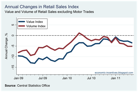
The May Retail Sales Index was released by the CSO earlier today.  The up-down volatility in the series that was seen around the turn of the year has now been replaced by downward momentum.

Ex Motor Trades Index to May

Both the value and volume series are now down to the minimums there were recorded last December.  The drop to these levels in December was largely influenced by the extreme cold weather that the country experienced.  There is no such meteorological explanation for the return to these levels in May.

Annual Change Ex Motor Trade Index to May

Unsurprising, the annual changes are moving further away from zero.  Value is now 3.5% behind last year and volume 5.1% down on last year.  We had expected that the annual comparisons around now would be negative even if the index had managed to stop falling. It hasn’t and the annual drops are getting larger.

Monthly Change Ex Motor Trade Index to May

The recent volatility is highlighted by the monthly changes but the jumps from positive to negative have been replaced by a series of negative monthly changes.  It must be all those pesky savers!

Presentation – Ireland’s Public Debt Crisis

Here are the slides I used for a presentation in UCC on Ireland’s Public Debt Crisis.

Monday, June 27, 2011

What are we saving?

There has been a lot of discussion following from Michael Noonan’s comments last week that “what we really need is for people to go into the shops and start buying again”.   Stephen Kinsella has a good post on this.  As a follow up to this it is useful to consider just what it is Irish people are saving.  To start here is a highly stylised and artificial example.

Consider that society is made up of two groups and that the disposable income of each group is 50.  The first group is the Thrifty Group. Of their disposable income they spend 40 and save 10.  The second group is the Profligate Group. They spend their income of 50and also borrow an additional 10 to increase their consumption to 60.

In this first period aggregate disposable income is 100 and total consumption is 100.  The savings rate is zero.

We then move to the second period.  The situation and behaviour of the Thrifty Group does not change.  They continue to have a disposable income of 50, spending 40 and saving 10 of this.  We will also assume that the disposable income of the Profligate Group does not change but they are now unwilling/unable to borrow to fund their consumption and they spend their entire disposable income of 50.

In this second period aggregate disposable income is 100 and total consumption is 90.  The savings rate is 10% but this was driven by a change in borrowing behaviour.  There has been no change in savings behaviour.

Finally, consider a third period.  Again we will assume no change for the Thrifty Group but now the Profligate Group have to pay back the money they borrowed in Period One.  We will assume that this requires a repayment of five, thus reducing their consumption to 45.

In this third period aggregate disposable income is 100 and total consumption is 85.  The savings rate is now 15% but again it is not because of any increase savings behaviour.

In Ireland the savings rate has shot up in recent years. 

Household Savings Rate

The suggestion from Michael Noonan is because this is as a result of an increase in savings behaviour.  It is true that a gap has emerged between household disposable income and household consumption.
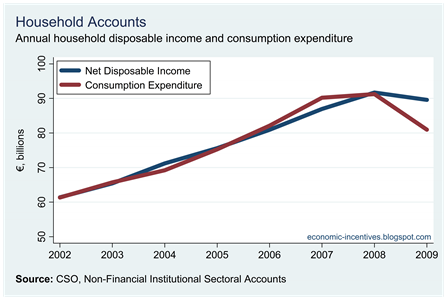
Household Expenditure

Although the data in this graph only go to 2009 all indications are that this continued into 2010 and will likely continue in 2011 and 2012.  In economics, the definition of savings is disposable income that is not spent. 

In 2008, both disposable income and consumption expenditure were around €90 - €92 billion.  In 2009, household disposable income fell slightly but consumption expenditure dropped from €90 billion to €81 billion.  The assumption is that this €9 billion is money that households could have spent, but are now choosing to save.  As we saw with our stylised example above, this could be a factor of borrowing rather than saving.

If we look at household financial accounts we see that this is more than likely the case.  First here are household deposits.

Household Deposits

During 2006 to 2008 when the savings rate was low household deposits were rising.  When the savings rate shot up in 2009, the increase in deposits slowed and had even begun to decline slightly during the end of 2010.   This is an aggregate of deposits.  It is likely for some households that precautionary deposits are increasing while for other households deposits are decreasing as they use them to offset significant reductions in income.

The savings rate might be a hefty 12% but this is not been seen in household deposits.  Michael Noonan may want people to go out shopping but they do not have an extra savings to draw on, household deposits are falling.

So where is the 12% savings rate going?  Well, as explained above it could be driven by a fall in new borrowings.  The Credit, Money and Banking Statistics from the Central Bank show that household credit is now contracting.

Household Credit Growth

The drop in growth of consumer credit is evident and since 2008 has moved from growing at 18% per annum to falling at 18% per annum.  Even if household income and savings amounts had remained unchanged this huge turnaround in consumer credit would have seen consumption expenditure fall.

Finally here is the aggregate amount of loans owed by households.
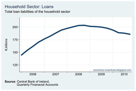
Household Loans

Since peaking in the middle of 2008, the amount owed on household loans has fallen from €203 billion to €185 billion.  Short-term loans have fallen from €14 billion to €9 billion.

The household sector may have a savings rate of close to 12% but there are no swelling deposits that could be used to boost consumption.  The savings rate has shot up for two reasons:

  1. Households are no longer borrowing to fund their consumption expenditure.
  2. Households are paying back the loans they previously used to fund their consumption expenditure.

One issue that cannot be addressed here is whether people are paying back these loans in an accelerated fashion.  The Financial Regulator produces data on mortgage arrears, those behind on their repayments.  It would be useful if we could get even a snapshot of those who are in mortgage advances, those ahead on their repayments. 

There may be households who are saving by paying down loans quicker than in the original contract.  It is difficult to say if this is true but the total amount of loans outstanding to households is falling quite rapidly.  It must be stated that it is falling from a huge height and is still 120% of GDP, well north of international averages.

So what impact is this huge savings rate having on household deposits? Very little.  What extra money is available for consumption? Not much.  There may be some money that is currently being used to accelerate the repayment of debt. This will continue for the medium term and once households have repaired their balance sheets they will be in a position to increase consumption relatively quickly.  It will take more than words from the Minister for Finance to get the tills rolling again.

Sunday, June 26, 2011

What can we default on?

Our continued insistence on paying unguaranteed debts in the banks has seen the State pour €46 billion into the six covered banks so far, with a further €18 billion or so to be provided as part of the ongoing recapitalisations.  Of this €64 billion, about €16 billion will have come from money that was built up in the NPRF, so by the end of this year the bank bailout will have created about €48 billion of debt.

There are many who view this as an unsustainable debt for the State to carry and that default is inevitable.  Personally I am still of the view that a sovereign default can be avoided but that does not mean that such a course of action should be discounted.   It is not inevitable but that does not mean it should not be considered as a policy option.
At the end of this year the General Government Debt will be around €170 billion.  In increasing order of importance that will be made up of the following components:

  • Retail Debt: €15 billion
  • Promissory Notes: €28 billion
  • EU/IMF Borrowings: €41 billion
  • Government Bonds: €86 billion

This €170 billion of debt will be about 108% of GDP.  The potential for substantial savings appears to be limited.  The €15 billion of retail debt is Prize Bonds, Post Office Bonds, Savings Certificates/Bonds and the National Solidarity Bonds.  It is very unlikely that there will be a default on these.

At the end of the year there will be €28 billion of Promissory Notes outstanding.  These are used by Anglo, and to a lesser extent, INBS as collateral with the Central Bank of Ireland to obtain Emergency Liquidity Assistance (ELA).   If payment is refused on these Promissory Notes, Anglo will not be a position to repay the ELA it is drawdown from the CBoI.  If that is the case who picks up the tab?  The answer is on page 104 of the CBoI’s 2010 Annual Report:

In addition, the Bank received formal comfort from the Minister for Finance such that any shortfall on the liquidation of collateral is made good.

The €28 billion of Promissory Notes seem an ideal candidate when considering a default as this money will disappear in the zombies that are Anglo and INBS with absolutely zero return for the State.  The problem is that it looks very difficult to escape the liabilities that are being covered by these Promissory Notes.

Default on the EU/IMF borrowings is a non-runner as these institutions have priority status on our list of creditors and are legally guaranteed to get their money back.  It may be possible to reschedule the repayment of these loans.  This repayment is due to begin in 2015.  Such a rescheduling would not be far removed from a default event but it would not reduce the aggregate amount of debt we are carrying.

That means we are down to the outstanding sovereign bonds that were issued prior to our shut-out from markets towards the end of 2008.  A full list of these can be seen here.  At the end of this year there will be €85 billion of these bonds outstanding. 

If a default is going to be worthwhile it would have to reduce our debt/GDP ratio to something around 75% that would mean the aggregate debt would have to be reduced from €170 billion to around €120 billion.

To make these €50 billion of savings it seems the only realistic possibility is to enforce significant haircuts on our outstanding government bonds.  This would have to be of the order of 60% across all government bonds to make the default worthwhile.  If the haircut is less than 60% it is hard to see how the savings to be made could offset the inevitable fallout of a default. 

It is unlikely that such a haircut could be introduced, but if it was it is more than a little incongruous that those who invested in senior bonds from our delinquent banks are getting their money back, while those who invested in the bonds of the country could be forced to carry losses.  Like lots of developments in the response to the crisis, this does not add up.

However, it does not seem that default could generate the required savings to make it a viable policy option.  We are not going to default on out retail debt.  The construction of the Promissory Notes makes it very difficult to escape from the liabilities they cover.  The EU/IMF have preferred creditor status and are virtually guaranteed to get repayment on their loans.  That leaves, our government bonds. 

The yields on these indicate that markets know that this is where the risk lies.  Current market prices have an in-built 40% write-down included in them.  The haircut would need to be half as large again to make it worthwhile.

Friday, June 24, 2011

Per Capita Consumption Resumes Fall

The release of the Q1 2011 National Accounts yesterday has sparked a variety of responses such is the inconsistency in the figures between differing quarterly changes in GDP and GNP as well as substantial revisions to the annual figures to 2010.

Here is a chart that uses two CSO data series:

  1. Quarterly estimate of private consumption at constant market prices (seasonally adjusted)
  2. Quarterly estimate of the population aged 15 plus from the QNHS

Although the CSO may not approve we will use these to create a rather crude measure of per capita consumption.  There are probably a number of difficulties with this approach which was prompted by a comment on recent falls in the Retail Sales Index.  Is the index falling because people are spending less as a result of decreased incomes or is the index falling because there are less people to spend as a result of outward migration?  We attempt to address that here.

So what do we see when we divide 1 by 2?

Per Capita Consumption

After flat lining for four quarters from the end of 2009, this series turned downward in the final quarter of 2010 and this has continued into 2011.  Per capita consumption fell 1.7% in the quarter and is down 2.5% on the year.  We can see that the most severe fall occurred during 2008 and we are now 11.5% below Q1 2008. 

It did appear that through 2009 and 2010 the worst of the fall was behind us but the start of 2011 undermines that view with per capita consumption resuming its downward path. This will not be to the approval of Minister for Finance, Michael Noonan based on this report.

In an appeal aimed at those Irish people who are holding a total of €134bn in savings accounts, Mr Noonan said it was time to return to normal shopping habits.

"What we really need is for people to go into the shops and start buying again,'' said Mr Noonan in a message to those who had the cash to spare.

“If that starts, with tourists visiting our shores stimulating the retail side, and is followed by our own ordinary citizens going about their shopping and beginning to spend again, then we begin to lift out of the crisis," he said.

A Supreme Court Judge on Economists

Today’s Irish Independent carries a report (HT: my colleague Geraldine Ryan) on an conference in Dublin yesterday on the use of expert witnesses in trials.  The article ends with some comments from a Supreme Court judge on the use of economists as experts in trials.

Meanwhile Supreme Court judge Fidelma Macken said economists proved to be the most frustrating experts to appear before a court as they were unable to clearly set out what they want to say.

"The bane of most judges' lives is to see a group of economists coming into court speaking the most unbelievably incomprehensible language known to mankind and it couldn't be just that all the judges are dumb," she said.

"There is this inescapable inability on the part of economists to explain what must be reasonably simple concepts in reasonably clear and simple terms."

Ouch! I wonder which economists have appeared in her court.

Yields go past 12% and we’re printing t-shirts

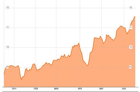
It might only have been for a fleeting moment but the measure of Irish 10-year bond yields as constructed by Bloomberg broke through the 12% barrier this morning.

Bond Yields 1D 24-06-11

It fell below 12% as quickly as it rose above it but at 11.9% the difference is marginal.

What has been the response of the Minister of Finance? “Let’s print some t-shirts.”  This is from a report in today’s Irish Examiner.

"We are thinking of printing t-shirts in the Department of Finance, they won’t be given out free, they will be for sale of course, saying ‘Ireland is not Greece’ ... across the front and back of them," Noonan said.

Tuesday, June 21, 2011

Jobs Month

A quick search of the RTE website unearthed the following stories that were published over the past month (23rd May to 24 June).  There were 17 stories posted to the website announcing new jobs.

In total these announcement are around 2,000 jobs.  This may not amount to much in the face an unemployment crisis that has 352,000 classifying themselves as unemployed but at least it shows some signs of life in the labour market.  My search also revealed a number of stories reporting job losses but they numbered only about a third as many.

It is also important to note that these are ‘job announcements’ rather than ‘job advertisements’.  It could be a year a more before many of these come on stream but it is still better to have announcements like this rather than not.

March External Trade Data

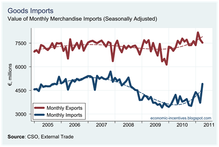
It’s been a while since we looked at the CSO’s monthly External Trade data for Merchandise Imports and Exports.  We will get our first look at Services Imports and Exports for 2011 when the Balance of Payments is released with the National Accounts on Thursday.

Here we will examine the March External Trade Release with provisional overall figures for April.

Monthly Imports to April 2011

The provisional figures for April show a rise in imports and a fall in exports, though the trend for both series remains positive.  Not surprisingly, these monthly changes mean that the balance of trade declined markedly in April with a fall to its lowest level in 16 months.

Trade Surplus to April 2011

As the April figures are only provisional we do not have a breakdown by category that would allow us to explore the drop in exports and rise in imports in April.  The current release does give us the breakdown for March so we can have a look at the trade performance over the first three months of the year.

First up here are exports for the first quarter of the last five years. Click the table to enlarge.

Export Tables

The figures for 2011 are remarkable and for all the named categories, exports are ahead of the 2010 levels.  In fact the only  category that is behind on its 2010 performance is the generic “Other Commodities” category which only makes up 0.1% of the total but has shown a rather alarming 96% fall.  In categories making up 99.9% of the total exports are showing an annual increase.  There may be some classification issues at play here.

As per usual caution must be exercised when looking at aggregate merchandise trade data from Ireland such is the dominance of the Chemical and Pharmaceutical sectors in the figures.  For the first three months of 2011, exports from this category made up 62.6% of the total and are up 13.5% on 2010.  Of the €1.8 billion increase in exports, €1.7 billion can be accounted for by the Chemicals and Related Products category.  Excluding chemicals, exports are showing some annual growth but it is a much more modest 1.1%.

Compared to pre-crisis levels from 2007, exports are also showing positive performance with a 3.1% increase.  Again, however, this is largely down to increases in chemicals and pharmaceuticals.  Excluding Chemicals, Irish exports are still 24.6% behind those levels recorded in 2007 with most of this attributed to the Machinery and Transport Equipment category, and within that most of the drop is as a result of the fall in computer exports.

Some categories are up on their 2007 levels, most notably Food and Live Animals and Miscellaneous Manufactured Items which between them make up about one-sixth of our exports.

Next we turn to imports.  Again click the table to enlarge.

Import Tables

As per exports, imports are showing growth on their 2010 levels and this can be seen across all the main categories.  We will return to imports in a few minutes when we look at the figures on imports by use.

The final table by category is for the Balance of Trade.  Click to enlarge.

Balance of Trade Tables

The trade balance for 2011 is at record levels and is 82% higher than that recorded in 2007 but it must be remembered that nearly 90% of this rise is due to the fall in imports rather than a rise in exports.

A second noticeable element is the dominance that the chemicals sector plays in determining our trade balance.  In fact, excluding Chemicals the balance of trade has been continually in deficit.  Up to 2010 this deficit had been declining but this was reversed in 2011.

Trade Balance excluding Chemicals

The role Chemicals play in our export data cannot be overstated.  Over the past five years chemical exports have grown from about €3.5 billion a month to €4.5 billion a month with a large spike in March 2011 to €5.5 billion.

Chemical Exports to March 2011

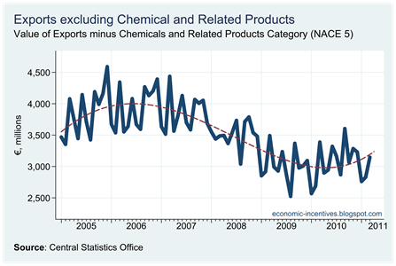
Excluding chemicals, the exports performance is not as “robust” or “resilient” as the first graph above would indicate, though there was a stabilisation from early 2010 and some tentative signs of improvement later in the year.

Exports excluding Chemicals to March 2011

Imports on the rise – but in a good way

Today’s External Trade release shows that exports to March are up 8.5% on the year with imports showing a rise of 12.3% with the net effect of these leading to a rise of 4.4% in the balance of trade (though all of this is due to chemicals).  In the arithmetic of national accounts, imports are subtracted in the calculation that leads to GDP.  However, it is also important to look at the composition of those imports.

The CSO provide a useful table that gives a breakdown of imports by use. Click to enlarge

Imports by Use Table

Imports are up €1.4 billion on the year and there is annual growth in all the categories.  What is noteworthy is that capital and intermediate goods for production make up nearly two-thirds of total imports.

Of the €1.4 billion rise in imports, €0.3 billion is for capital goods for production and €0.6 billion is for intermediate goods for production.  The remaining €0.5 billion is for consumption goods.

On the whole, the rise in imports may subtract from GDP figures now but over the coming months as these capital goods and materials are put into use it will lead to an increase in economic activity and a likely increase in exports which will push GDP up.  Here is the same data in a graph.

Goods Imports by Use

The rise in the imports of production materials since the middle of 2010 is evident as well as a gradual recovery in imports for consumption.  The capital goods series is more volatile.

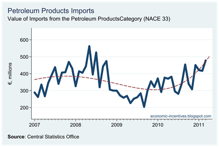
Here are a couple of notable import categories that are also showing increases.

1. Petrol

Petrol Imports

2. Cars

Imports of Road Vehicles

3.  And some goods involved in production

Imports by sub-category

After scratching around for the past two years, these categories have been showing some smalls signs of growing over the first three months of the year (though they are all well down on the peaks of 2006 and 2007 – see graph here).

Friday, June 17, 2011

Labour Market Status – the full-time employed

The QNHS may be beginning to signal that stabilisation in the labour market is not far away.  In a previous post we examined the principle economic status of individuals.  Here we focus on the group who classed themselves as ‘at work’ to determine how real this stabilisation is.

Here is a snapshot of the labour market status of the population aged over 15 since 2003.

Labour Market Status Status

Two things are immediately obvious from this graph.

  1. The increase in the population aged over 15 stopped in the middle of 2007.
  2. The fall in the number of people in full-time employment since the middle of 2007.

The reasons for the stalling of the population over 15 have been discussed elsewhere (it is largely the departure of non-Irish nationals).  Here we will look the numbers in employment.

Total Numbers Employed

Looking at the total number employed it suggests that labour market conditions are back to those last seen in early 2003.  Since the peak in 2007 the numbers employed in Ireland has fallen by 346,000.  The decline is continuing and two-thirds of the fall in the past year has been among non-Irish nationals who have subsequently left the country.  However, from the perspective of overall economic performance it doesn’t matter who they are and the 55,000 decline in employment in the past year is a continuing negative sign. We can also see the breakdown on the patterns on which is it likely the CSO’s seasonal adjustment methodology is based, the problems with which were noted here.

However, looking at the total numbers employed only gives a partial picture.  Next we consider the number of people in full time employment.

Full Time Employed

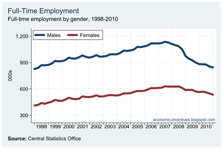
This is far worse than the total number employed and the decline is showing no signs of abating. Full-time employment is now back to levels last seen in 1999.  If this continues we will drop below the levels recorded at the start of the dataset in 1998.  When we examine the breakdown by gender we see that one group already are.

Full Time Employed by Gender

Male full-time employment is back to levels last seen in 1998.  Female full-time employment is declining and is back to 2004 levels.

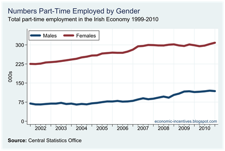
Although the level of full-time employment has continued to head south, part-time employment has continued onward ever upward.

Part Time Employed

And these increases have been seen for both genders.

Part Time Employed by Gender

This reduction in full-time employment and increase in part-time employment gives rise to the following.

Proportion Full Time Employed

After hovering around 83% for nearly a decade the proportion of workers who are employed full-time has now declined to 76%.

The final graph of this set looks at the change in male employees and self-employed workers.

Male Employees

Since the middle of 2008 the number of male employees has fallen from 925,000 to 720,000, with a fall from 299,000 to 236,000 for male self-employed workers.  The equivalent fall for females employees is from 856,000 to 779,000 while the number of female self-employed workers fell from 63,000 to 57,000.  Male employment is down 268,000 with an 83,000 drop in female employment.

Principle Economic Status – Self Assessed

The QNHS is used as the primary measure of unemployment in Ireland.  We already saw that there may be some issues with the method used by the CSO to estimate the seasonally adjusted unemployment rate.  A second issue emerges when we consider the definitions of employment and unemployment used by the CSO.

In Employment: Persons who worked in the week before the survey for one hour or more for payment or profit, including work on the family farm or business and all persons who had a job but were not at work because of illness, holidays etc. in the week.

Unemployed: Persons who, in the week before the survey, were without work and available for work within the next two weeks, and had taken specific steps, in the preceding four weeks, to find work.

Working for one hour in the week prior to the survey means that the respondent is classified as employed.  The QNHS includes an additional question that asks people so self assess “their usual situation with regard to employment” and gives the following response categories:

  • At work
  • Unemployed
  • Student
  • Engaged on home duties
  • Retired
  • Other

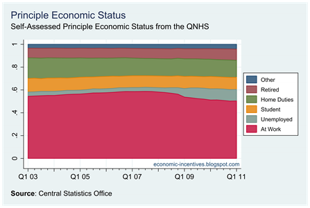
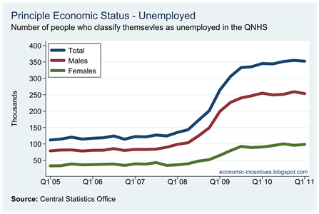
Using this measure there are 352,000 people who classify themselves as unemployed which differs from the 295,000 people on which the 14.0% unemployment rate.  Here are the proportions of the above categories for the population aged over 15 since 2003.

Principle Economic Status

The changes may not be as pronounced as some might expect but the largest change since 2007 is obviously the drop in those at work and the rise in those unemployed.  Since Q4 2007 the proportion at work has fallen from 58.6% to 50.4%.  Most of this reduction has been picked up in the proportion unemployed which has risen from 3.5% to 10.0%.  The other categories are largely unchanged.

The 352,000 people who classify themselves as unemployed further belies the claims by many that there are 450,000 people unemployed in Ireland based erroneously on the numbers on the Live Register.  The Live Register is not an accurate measure of unemployment.  However, as we saw previously we could be closer to this 450,000 figure if many of those who have left employment had not also left the country (and in the majority of cases these were non-Irish nationals). 

Any claims that there are 450,000 unemployed are wrong.  The “official” figure is 295,000 and the “self-assessed” figure is 352,000.

If we use the sum of those who classify themselves as at work or unemployed as a measure of the labour force then the implied unemployment rate from this question in the QNHS is 16.1%.  The headline rate might be showing some improvement but that is not reflected in how respondents to the QNHS see their reality.

Number Unemployed by Gender

Nor is there any improvement when we look at those at work.

Number At Work by Gender

Using these measures it appears that the labour market is not getting any worse, but not getting worse is not the same as getting better.  Hopefully this stabilisation will convert to improvement over the coming quarters.

Adjusting Unemployment

Yesterday’s release of the the QNHS saw the headline rate of unemployment fall from 14.8% in Q4 2010 to 14.0% in Q1 2011.  This “improvement” must be examined in the light of the continued FALL in the numbers employed which fell from 1,823,200 to 1,804,200.  The unemployment rate fell but the numbers employed fell by nearly 20,000.

Another issue to consider is the fact that it is the seasonally adjusted rate which is usually given the most weight when assessing changes in unemployment.  However, over recent quarters this seasonally adjusted rate has exhibited a volatility which may not be reflective of actual outcomes in the labour market.  Here are the adjusted and unadjusted unemployment rates.

Unemployment Rates

Over the past three quarters, the adjusted rate has gone from 13.5% to 14.8% to 14.0%.  Over the same timeframe the unadjusted rate has been 13.9%, 14.1% and 14.1%.  The volatility in the adjusted rate suggests that labour market conditions deteriorated markedly in Q4 2010 and then improved again in Q1 2011.  It is likely that neither occurred and there has been no significant change in unemployment as reflected in the unadjusted rate.

There seems to be some problem with the Q4 adjustment made by the CSO.  If we look at the 2009 numbers we see that in Q4 another gap emerged between the adjusted and unadjusted rates.  This also happened to a lesser extent in 2008.

It may be that the CSO itself needs to adjust its adjustment method for the unemployment figures to better reflect the muted performance of the Irish economy in recent years.  The headline unemployment rate may have gone from 14.8% to 14.0% but I don’t think we’ll be cheering it just yet.

“It’s all Greek to me”

Students of economics are often faced with a plethora of Greek symbols leading many to despair “it’s all Greek to me”.  For the past while all things Greek have jumped from econometrics textbooks to the economics headlines.  And the turbulence is being felt over here.  This graph from Bloomberg shows an average 10-year yield for Irish government bonds.

Bond Yields 6M to 17-06-11

You can see that actual yields at yesterday’s close for the outstanding Irish government bonds in this daily report from the NTMA.

Since the start of the year Irish bond yields have been rising almost incessantly.  The only notable decline took place in the 10 days following the March 31st stress tests of our ailing banks, which did garner some international credibility.  That fall was quickly reversed and the yields quickly rose back above 10% and have recently settled above 11%.

Today has already been a volatile day and after opening at 11.55% an hour ago the yields are up to a record 11.69%.  The Department of Finance, IMF, European Commission might be saying that the rescue package is working but we are getting further and further from a return to these markets to raise money rather than closer. 

When the IMF rolled into town the 10-year yield was 8% and it was felt that was sufficient to warrant calling on external help.  Six months into that rescue package and the yields are racing to 12%.  The torpor in the Irish economy continues but there has not been negative news in the past two months that can explain our surging bond yields. 

It is been political rather than economic developments that have driven the changes and it is clear that political institutions at national, European and international level do not have a credible strategy for dealing with this debt crisis.  This is now coming to a head in Greece and it is expected that a similarly disjointed approach will be taken when the circus returns its focus on Ireland. 

Ireland may not be Greece but with the same people providing the “solutions” it is not hard to see why our yields are moving so closely together.

From an Irish perspective this can be readily summarised using Michael Noonan attempt at kite-flying from Washington during the week when he suggested that burden-sharing with the €3.5 billion of senior unguaranteed unsecured debt in Anglo and INBS was back on the table.  What has been the reaction of the ‘troika’?

  • According to Noonan the IMF support this idea but no one in the IMF has actually come out and said this.
  • The European Commission have said they “always ready to consider any proposal” but hadn’t heard anything about this latest move.
  • And the ECB? Well, the ECB is so opposed to burden-sharing that they still think that Greece can pay back all its debt.

And we wonder why the markets are reacting as they are.  Seems perfectly rational to me.

UPDATE: Today’s volatility has continued and the breakfast time rise to 11.7% percent has been followed by a lunchtime drop to below 11.4%.  Check out the 1Day graph here though movements like this at these levels are largely academic.

Thursday, June 16, 2011

Wages remain ‘sticky’

UPDATE: The original version of this post was based on incorrect numbers that were posted to the CSO website yesterday.  This has now been corrected and so has this post.  The correct figures do not suggest that wages are as ‘sticky’ as the post title might suggest.

-------------

As well as the QNHS, the CSO have today released the Q1 2011 Earnings, Hours and Employment Costs Survey.  Here are the average weekly earnings for the overall economy with the public and private sector averages also provided.

Gross Weekly Earnings

The average weekly wage in the economy in Q1 2008 was €704.  Three years later and after the deepest, and swiftest, recession this economy has seen the average weekly wage in the economy is €675.  Average gross weekly wages have fallen by 4.2%.  Income Tax increases will have further reduced net pay.

In the public sector, the last three years has seen the average weekly wage move from €905 to €871.  The drop below the Q1 2008 level that occurred in Q1 2011 is partially the result of 5,200 temporary employees hired for Census 2011.  If these employees are ignored average weekly gross pay in the public sector was €881.  Average weekly gross pay in the public sector is down 2.6% since the start of 2008 but is unchanged since Q1 2010.

This is even after the public sector wage cuts announced in the December 2009 budget which gave rise to the largest fall seen in the graph.  It should be noted that these gross figures do not account for the public sector pension levy introduced in April 2009 which resulted in an average 7% reduction in take home pay for public sector workers that was not applicable to private sector workers.

In the private sector average weekly wages have fall from €643 to €603, a fall of 6.2%.  It can also be seen that private sector wages have continued to fall with a 1.8% fall recorded in the year since Q1 2010.

A word of caution should be noted when interpreting these averages.  These averages are simply the total pay bill divided by the number of employees.  In recent times both the numerator and denominator of this ratio have been changing.  For example, although wages are showing little change, this could because job losses are concentrated among lower paid workers (causing average wages to rise), while wages fall for everyone else (causing average wages to fall).  The aggregate effect of this could be static average wages.

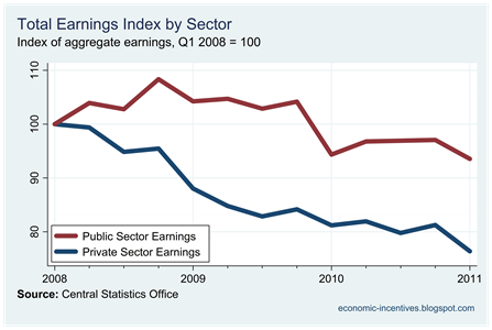
To show the effect of job losses here is an index of total earnings for the public and private sector. 

Pub-Priv Index of Aggregate Earnings

Gross earnings in the public sector are down about 6% since the start of 2008 (and over 10% since the end of 2008).  In the private sector gross earnings are down 24% on the start of 2008.

In both the public and private sectors aggregate earnings were largely unchanged during 2010 and the seasonal drop usually recoded in the first quarter is also seen in 2011.  Here is a snapshot of aggregate earnings for the entire economy.

Index of Aggregate Earnings

Employment by Sector

In this instance we will use today’s QNHS figures to look at the change in employment by sector, and in particular the changes in employment for Irish and non-Irish nationals. Here are the numbers employed by sector.

Numbers employed by sector

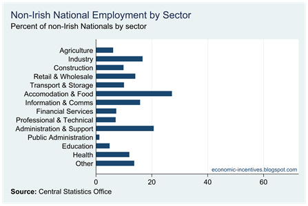
Nearly two-thirds of non-Irish national employees are in just four sectors: industry, retail,accommodation and food service and health.  In the fourth quarter of 2007 there were 48,000 non-Irish nationals working in the construction sector.  Now it is just 9,000. 

These are the proportions of workers in each sector who are non-Irish nationals.

Percent non-Irish by sector

Here are the changes in employment by sector.  The huge drop in construction employment for non-Irish nationals can clearly be seen.

Change in Non-National Employment

Employment for non-nationals has fallen in all sectors since the peak in the final quarter of 2007.  If we look at the same graph for the past year we see the following:

Annual Change in Non-National Employment

Employment is still falling in 13 of the 14 sectors.  The only sector with growing non-Irish national employees is the Agriculture sector.

Finally we will compare the last 12 months for Irish and non-Irish nationals. Click to enlarge.

Change in Employment by Nationality

A somewhat contrasting picture emerges of the labour force outcomes for Irish and non-Irish nationals.  Both groups have continued to see job losses in construction,  retail and, to a lesser extent, financial service.  For Irish nationals, there continues to be a large number of jobs shed in industry.

However, while agriculture is the only one of the 14 sectors shows an increase in employment for non-nationals, over the past year employment of Irish nationals has risen in seven of the 14 sectors, but it must be noted that these rises are modest and do not offset the jobs lost in declining sectors.

Over the past year there has been a decline of 18,800 (or 1.2%) in the number of Irish nationals employed, while at the same time there has been a decline of 34,500 (or 14.5%) in the number of non-Irish nationals employed.

Changes in Employment and Unemployment

Here’s another quick update from today’s QNHS release.  Here are the absolute changes in employment and unemployment since the third quarter of 2007 (peak employment).

Since 2007 there has been a reduction of 345,000 in the number employed.  Over the same period the number unemployed has risen by 198,000.  Over the past three quarters the number employed has fallen by 47,000 and over the same time the number unemployed has also fallen (though only by 3,000).

All Cumulative Changes

If the reduction in the numbers employed had corresponded exactly to the increase in the numbers unemployed, then the number unemployed would be nearly 450,000 rather than the current figure of 295,700.

As before the question is: where did these 150,000 people go?

We get a small part of the answer if we look to Irish nationals.  The gap here is around 50,000.  There has been a fall of 216,000 in the numbers employed and a rise of 168,000 in the numbers unemployed.  We can also see that over the past two quarters both of these measures have been largely unchanged.

Irish Cumulative Changes

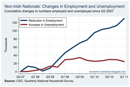
The picture is somewhat different when we look at non-Irish nationals.  There is a huge gap between the reduction in employment (139,000) and the increase in unemployment (24,000).

Non-Irish Cumulative Changes

We can also see that there has been an acceleration in the reduction in employment for non-Irish nationals which fell by 17,000 in the first quarter of 2011.  At the same time the number of unemployed non-Irish nationals also fell (by 5,000). 

It is clear that a lot of the recent dynamics in the Irish labour force is being driven by the departure of non-Irish nationals from the country.

Changes in the Labour Force

The CSO have just released the Q1 2011 Quarterly National Household Survey (QNHS).  The headline number is that the seasonally adjusted unemployment rate has fallen from 14.8% to 14.0%.  Here we will continue our series that looks at the composition by nationality of the labour force.

First up, the number of non-Irish nationals in the labour force.

Non-Nationals Total

Since peaking at 366,000 at the end of 2007, the number of non-Irish nationals has declined by nearly one-third and now stands at 248,000.  There has been a reduction of 143,000 in the number of non-Irish nationals in employment but an increase of only 24,000 in the number of unemployed non-Irish nationals to 45,000.  In fact over the last two quarters both the number of non-Irish nationals employed and unemployed has been falling.

As a percentage of the labour force the number of non-Irish nationals is now back to levels last seen in 2005.

Non-Nationals Percent

As in previous quarters the biggest driver of these changes has been workers from the EU-Accession states who account for more than half of the drop of the number of non-Irish nationals in the labour force.

Origin of Non-Nationals

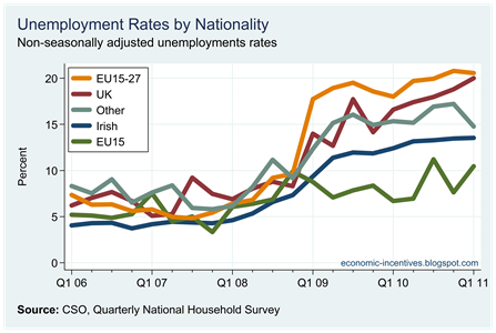
Although the numbers of unemployed non-Irish nationals has been falling the unemployment rate among non-Irish nationals (18.1%) remains higher than among Irish nationals (13.1%) 

Unemployment Rates by Nationality

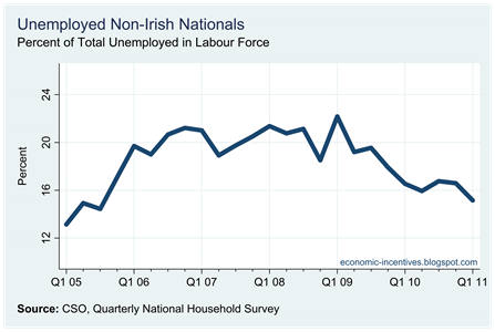
Of the 296,000 total unemployed, 45,000 are non-Irish nationals and 251,000 are Irish-nationals.  The proportion of those unemployed who are non-Irish nationals has been steadily declining since 2009. 

Non-Nationals Unemployed Percent

In the first quarter of 2009, 22% of those unemployed were non-Irish nationals.  This has now fallen to 15%.  The final graph in this post gives a breakdown of the unemployment rates.

Unemployment Rates by Origin

 
Unsecured Loans Proudly Powered by Blogger