Friday, April 30, 2010

The PIIGS are up to their eyeballs in debt

To get an idea of the debt crisis faces the euro have a look at this table from here giving the debt refinancing and deficit financing requirements of the PIIGS countries for the next four years.  The required amount is close to $2 trillion and it is suggested that a full bailout could come to close to $1 trillion.

PIIGS Debt Finance

To get an idea of much money is needed to keep these countries going a picture of a trillion dollars in €100 dollar bills is below the fold.


trillion

And the PIIGS need two of these!

Hat-tip

Wednesday, April 28, 2010

The Recession is over

says Davy Stockbroker’s Head of Research, Rossa White.
In a little over two weeks White has gone from claiming that the recession is almost over to claiming that the recession is over.  The full report published by Davy today can be accessed here.

Tuesday, April 27, 2010

Dublin Port Traffic still rising

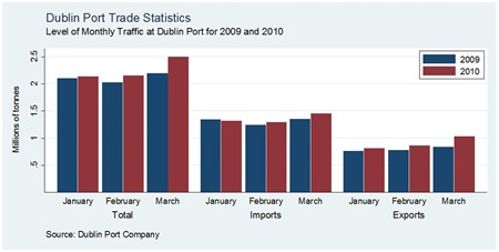
Following the annual increase we saw for the February, Dublin Port have reported that this trend has increased in March.  Click to enlarge.
Dublin Port March
Total traffic at the port in March was up 13.5% by weight when compared to the same month last year.  There was a much stronger performance in exports (+23.5%) than in imports (+7.3%).
The increase in exports is likely to be driven by the improved performance in several of our main trading partners.  The relatively subdued performance of imports is reflective of the continued stagnancy of the Irish economy, though the annual changes in imports are going in the right direction (January (-1.9% ), February(+3.7% ), March(+7.3%)) to suggest some improvement in domestic economic activity.

Ministerial pensions

There has been a minor kerfuffle over the past few days about the payment of pensions to former Ministers, most notably our current EU Commissioner Máire Geoghegan-Quinn.

Today Labour have announced plans to introduce legislation aimed at changing the current regulations.  From RTE:

The Labour Party is to draw up legislation to ban the payment of ministerial pensions to serving politicians.

This afternoon, Labour leader Eamon Gilmore said their legal advice was that there was no constitutional impediment to such legislation.

I have just one minor issue with this.  Shouldn’t we wait to pay pensions until people are actually retired (i.e. over 65). 

Not wanting to pick on anyone, but just to give an example, Ivan Yates has been in receipt of a ministerial pension since 1997.  Ivan Yates is 50 and has been receiving this pension since he was 37.  Ivan Yates did not retire when he left politics in 2002.  He is managing director of Celtic Bookmakers and has a fairly successful broadcasting career.

I have no problem giving Ivan Yates a pension for the service he did as Minister for Agriculture.  But surely we should wait until he is retired before we pay this deserved pension.

UPDATE: Unknown to me, Ivan Yates actually addressed the issue of his Ministerial Pension on The Breakfast Show on Newstalk this morning which he co-presents.  A copy of the piece is available here

15% and climbing

The continued fall in the price of Greek bonds continues unrelenting today.  The yield on 2-yr bonds has now reached an incredible 15%.

This means that if you bought €1,000 worth of 2-year Greek bonds you would expect to receive about €1,300 between interest received and principal repayments on maturity of the bonds.  This would obviously depend on how long the bonds have to maturity and the figure given here assumes that this is close to two years.

Most of this return will be based on getting the principal back as existing Greek bonds have a coupon rate of around 5%.

Turning €1,000 into €1,300 in just two years is a great return.  The reason for this is that there is obviously a great risk.  Greek bonds are cheap because markets are doubting the country’s ability to meet the interest and, in particular, the principal repayments.

Some firm numbers are given in this piece.  To buy €1,000 of a 4.3% Greek tw0-year bond due in March 2012 cost €786.70 just before the close at 5pm today.  Spend less than €800 to get €43 a year in interest and €1,000 principal in two years time.

Would you be willing to take the risk?  Felix Salmon is not.  At 15% I think it may be worth the risk.  The EU couldn’t let Greece default. Could they?

Ratings agency Standard & Poors have cut their rating of Greek sovereign debt according to Bloomberg:

Greece’s credit rating was cut three steps to junk by Standard and Poor’s, the first time that’s happened to a euro member since the currency started, as contagion from the nation’s debt crisis spread through the bloc.

Greece was lowered to BB+ from BBB+ by S&P, which also warned that bondholders could recover as little as 30 percent of their initial investment if the country restructures its debt. The Greek move came minutes after the rating company reduced Portugal by two steps to A- from A+. The euro weakened, stocks plunged and the extra yield that investors demand to hold Greek and Portuguese bonds over German bunds surged.

Monday, April 26, 2010

Do defaults matter?

With talk of sovereign debt defaults abound, it is probably useful to consider the impact of such defaults. The Economist provides some useful insight into this from one of their recent Economics Focus pieces.  They suggest that defaults aren’t catastrophic at all.  The piece is here and this is a short extract.

Defaulting does affect the cost of funds to a country. A study in 2006 by a trio of economists at the Bank of England found that countries which defaulted between 1970 and 2000 had both a higher bond spread and a lower credit rating in 2003-05 than countries with the same debt-to-GDP ratio which did not default. In their study Messrs Borensztein and Panizza show that having defaulted is associated with a credit-rating downgrade of nearly two notches. Using data for 1972-2000, they also find sizeable jumps in bond spreads after a default. In the first year spreads widen on average by four percentage points. This additional cost declines to 2.5 percentage points the year after. These figures may understate the pain, however: as the Greek case shows, worries about default are enough in themselves to lead to an extended period of high spreads.

That said, markets appear to have short memories. Only the most recent defaults matter and the effects on spreads are short-lived. Messrs Borensztein and Panizza find that credit ratings between 1999 and 2002 were affected only by defaults since 1995. They find that defaults have no significant effect on bond spreads after the second year. This tallies with earlier research by Barry Eichengreen and Richard Portes. Studying bonds issued in the 1920s, they also found that recent defaults resulted in higher spreads but more distant ones had no effect.

The shine is wearing off

In a piece from Bloomberg, Ken Rogoff says that there is a 50/50 chance that Greece will not be the only bailout required in the eurozone.

Greece is unlikely to be the last euro nation to need an International Monetary Fund bailout, with Ireland, Spain and Portugal “conspicuously vulnerable,” said Harvard Professor Kenneth Rogoff.

“It’s more likely than not that we’ll need an IMF program in at least one more country in the euro area over the next two to three years,” Rogoff, a former IMF chief economist who has co-authored studies of financial and sovereign debt crises, said in a telephone interview. “The budget cuts needed in Europe in many countries are profound.”

At 14.3 percent of gross domestic product, Ireland had the euro region’s largest deficit last year. Greece’s was 13.6 percent, Spain’s was 11.2 percent and Portugal’s 9.4 percent.

The likelihood is “better than 50-50” that others in the 16-nation euro area will end up requiring help from the Washington-based lender, said Rogoff, 56. He expects the IMF will eventually dispatch more loans to Greece than the as-much- as 15 billion euro it’s currently offering.

See how yields on 2-year Irish government bonds have been faring here.  Check out screen captures of the Daily and Monthly graphs.  Just today 2-year Greek bond yields have shot up to 13% and can be followed here with daily and monthly screen captures. 

The FT have a quote that “this is the highest yield on short-dated government debt in the world”.  Higher yields mean the perceived risks are increasing.  More doubts here and less concern here.

Why is the music so loud?

The answer may be here.

And a study completed in the summer of 2008 in France found that when music was played at 72 decibels, men consumed an average of 2.6 drinks at a rate of one drink per 14.51 minutes. When the sound level was cranked up to 88 decibels, the numbers spiked to an average of 3.4 drinks, with one consumed every 11.47 minutes. Reasons for this acceleration may include an increase in ambient energy, and a consequent increase of difficulty in talking, which makes it easier to just signal the bartender for a refill than to engage in conversation. It may also be explained by actual changes in brain chemistry.

Friday, April 23, 2010

Greece goes for the aid

It didn’t take long!  Just a day after seeing yields on their bonds soar it turns out that Greece will ask the EU to act on their aid package agreed two weeks ago.  Short update here.

It makes perfect sense for Greece.  Why go to bond markets to borrow the money where the yields suggest that Greece would have to offer a coupon rate north of 8% to attract investors when Greece can go to the EU/IMF and get money at 5%?  Greek bonds yields have fallen back dramatically today from near 9% to just above 8%, and are still falling.  Click the 1D (one day) graph here.

The next development will be when Greece has exhausted the €45 billion currently on offer in aid.  If markets are reluctant to lend now who is to say they will be less reluctant in six months time.  Will the EU/IMF dig deeper and offer further emergency loans to Greece?  Will a default become a more likely scenario?  I think the probability of default is increasing. 

With Greece being only 2% of the eurozone, it does not pose a threat to the euro, but if Ireland and Portugal (in that order!) end up in a similar position this could change.  A similar concern is raised here along with a list of the ten most recent sovereign debt defaults.

Thursday, April 22, 2010

The cost of free food

In what might seem like an unusual step the government of earthquake-stricken Haiti has requested a stop to foreign food aid being provided to local residents.  CBS news explains why.

Of all the things you've heard about earthquake aid to Haiti, here's something you probably didn't know: Haiti's government wants large-scale food assistance and free health care to stop.

If it's news to you, it was to CBS News too, when Katie Couric recently visited Haiti and spoke to Erin Boyd, a nutrition aide for UNICEF. Boyd disagrees with cutting back on aid, but told why it's being done.

"When you continue having a lot of food distributions, you lower the price of food so that people can't trade, and it disrupts markets, basically," Boyd said.

In other words, CBS News correspondent Sharyl Attkisson reports, there may be such a thing as too much help. The public outpouring is so generous it's interfering with the Haitian economy.

If food is free local farmers can't sell what they grow.

The theory of unintended consequences strikes again.

Earnings Data

After a wait of over four months since we last examined earnings data on the Irish economy, the CSO have released the latest update of the Earnings, Hours and Employment Costs Survey.  This gives updated data for Q3 2009 so there is a significant lag in how quickly the data is published.
The headline figure is that there was a small drop of 0.8% in weekly earning in Q3 2009 compared to the same period 12 months earlier.  However, it should be note that hourly pay actually increased by 1.8% with the drop in earnings driven by a fall in the weekly hours worked of 2.6%.
Average weekly earnings in the private sector fell by 2.7%, while there was an increase in average weekly earnings in the public sector of 1.9%.  Note though that these are gross earnings and the public sector figures ignore the effect of the public sector pension levy introduced in March 2009.  This levy reduced take home pay in the public sector by between 5% and 8%. 
Average Weekly Earnings
Annual Change
Quarterly Change
Industry
778.47
+0.1
-2.1
Construction
736.74
-2.4
-0.5
Retail & Wholesale
492.17
-3.2
-0.8
Transport & Storage
709.43
-6.6
-6.8
Accommodation & Food Service
352.64
+0.6
+2.9
Information & Communication
925.39
-5.3
+0.8
Financial, Insurance & Real Estate
901.02
-2.3
-3.3
Administrative & Support Services
798.52
-0.1
-1.1
Professional, Scientific & Technical
466.77
-3.8
-5.5
Public Admin & Defence
982.08
+3.0
-1.0
Education
878.10
-1.9
+1.6
Health & Social Work
759.68
+4.6
+0.8
Arts, Entertainment & Others
462.41
-8.9
-2.3

Spot the difference - update

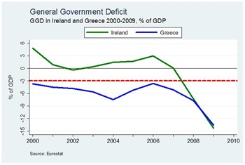
In a post back in March we looked for differences between the Greek and Irish budgetary situations.  We came to two conclusions in terms of the size of the debt problems relative to each country’s GDP.

  1. The annual government deficits in Ireland (-11.7%) and Greece (-12.5%) were similar.
  2. Ireland was in a getter position as it was coming from a relatively low overall debt position (64% versus 115%).

It turns the first of these was wrong!  Today Eurostat released a revision of the 2009 government deficits.  The updated figures show that Ireland had the worst government deficit in 2009 running at 14.3% of GDP.  The Greek figure was also revised upwards to 13.6%.  The primary reason for the revision of the Irish numbers was the inclusion of the €4 billion capital injection in Anglo Irish Bank made last made to the general government deficit.  The reaction of the Minister for Finance is here.

Our spot the difference graph now looks like this.

General Government Deficit

The international reaction to the figures has focused on Greece. See here, here and here.  These reports give no attention to the Irish figures.  Domestic media loudly (proudly?) declare that Irish 2009 deficit biggest in the EU

The revision hasn’t been ignored on bond markets if we look at the daily changes in the yield on the 10-year Irish government bonds – graph here.  Not as bad as has been happening to Greece today but going in the wrong direction nonetheless.  The ‘others believe in us’ mantra may be losing its shine.

Greece on the brink

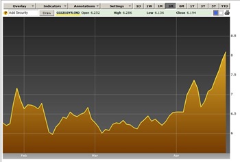
Bond yields on 10-year Greek government bonds have soared above 8%.  Here is a 3 month graph from Bloomberg to yesterday’s close.  Click to enlarge.

Greece Bonds

The drop seen after the announcement of the EU/IMF support package has been wiped out and yields are at new record levels.  The yield went over 8.3% for a time yesterday but dropped by the market close to 8.1%.  

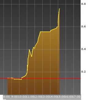
Greece Bonds DailyToday has been another rollercoaster as we can see with graph on the right which gives the most recent real-time data for the 10-year Greek bond yield. The yield now charging towards 9% and only going in one direction.

The reason for this is an increased perception in the risk of Greek bonds, which is driving the price down.  As the price goes down the yield goes higher.  More graphs here.

When Greece comes to borrow money from bond markets (and they will have to borrow a lot) the interest rate they have to offer to get lenders will be determined by the yield investors can get from buying existing bonds on bond markets.

Greece now faces the choice of going to the markets to refinance their debts and rates of 9% or higher or calling in the support of the EU/IMF who have offered money at 5%.  Which one would you go for?

Wednesday, April 21, 2010

Two lines for a decade

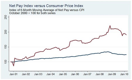
The following graph contains two lines tracked for almost a decade.  Click the image to enlarge.  The two lines are:

  1. The Consumer Price Index
  2. Six-month moving average of my net pay

Pay versus CPI

Both series are set equal to 100 in October 2000 and changes are relative to that level.  I won’t indicate which line is which but you can have a good guess!

Of course this is a bit of a moot comparison for a multitude of reasons and it really is just a graph with two lines rather than revealing anything significant.  Here are just two.

  1. The CPI is a price index and not a cost-of-living index.
  2. Changes in pay should be related to changes in productivity.

And there are many many more.  Still I thought it was interesting for what it is worth.

Monday, April 19, 2010

For anyone around Limerick today

George Lee is to make his return to the public forum with a lecture in the University of Limerick. Might be interesting.  More here and here.

George Lee: Former RTÉ Economics Editor and Fine Gael TD

Lecture: ‘Ireland’s Economic Collapse: Where To Now?’

Date: Tuesday 20 April 2010, 6pm

Venue: CSG01 – Computer Science Building

Friday, April 16, 2010

Here’s one who doesn’t ‘believe in us’

Nadeem Walayat writing on www.marketoracle.co.uk is definitely one commentator who does not believe in us. In fact he thinks we are worse than Greece.  Here’s an extract from the piece and the graph he uses to highlight his point.

The following graph attempts to paint an accurate picture of the current relative state of the trend towards bankruptcy of the worlds major economies which takes into account public and private debt, unfunded liabilities, budget deficits, and debt denominated in foreign currencies, as well as taking into account the historic track record of the countries in dealing with past debt crisis. The results are shown as a % of the countries risk of going bankrupt where Iceland would be at 100% following its defacto debt default.

Risk of Bankruptcy

Whilst the mainstream press these past two months has been obsessed with the Greek debt crisis, the above graph clearly illustrates that a far larger debt crisis looms in Ireland that could soon transplant Greece in the debt crisis headlines over the coming months, similarly a number of other Euro Zone countries head the risk towards bankruptcy league table with Belgium and Portugal not far behind Greece. The price that these countries pay for being stuck in the Euro single currency is that they cannot devalue to try and gain some competitive advantage for their economies and therefore try and grow and inflate their way out of a high debt burden that stifles economic activity.

I am a little unsure as to what the vertical axis of the graph actually means.  He seems to have created a bankruptcy measure based on a number of factors (public and private debt, budget deficits, etc.) and then indexed it so that Iceland represents 100%, as they have defaulted, and all other countries are scored relative to that. 

Whatever the methodology, and it appears questionable,  we have the worst score.  It is likely we will see more analysis like this produced on Ireland.

Wednesday, April 14, 2010

Retail Sales sub-Indices

Along with the All Business and All Business excluding Motor Trades the CSO’s Retail Sales Index provides 13 sub-indices.  Here are the seasonally adjusted monthly and annual changes for each of these sub-indices by volume and value for February.
Clicking any of the titles under the ‘Sub-Index’ heading will bring up a graph showing the values of the sub-index for the past three years, with the associated annual and monthly changes, as well as the weighting given to each sub-index in the overall Retail Sales Index for each month.
Sub-Index
Volume

Value


Monthly
Annual
Monthly
Annual
Motor Trades
+34.5%
+30.5%
+37.2%
+26.7%
-1.9%
-1.7%
-3.9%
-7.4%
+6.3%
+10.9%
+2.3%
-1.2%
-2.3%
-5.0%
-3.1%
-11.6%
+7.5%
-10.5%
+7.8%
+3.2%
+5.9%
+1.2%
+2.6%
-8.1%
+1.3%
+1.8%
-0.2%
-9.0%
+14.9%
+4.7%
+13.9%
-3.8%
+4.8%
-13.2%
+4.0%
-15.5%
+3.3%
+3.5%
+4.4%
-4.8%
-1.7%
-15.3%
-2.0%
-16.3%
+15.3%
+2.8%
+13.6%
-4.2%
-2.7%
-10.9%
-2.8%
-13.9%
We can see the very strong performance of the motor trades in February.    Overall there are still plenty of red figures in the table.  This is particularly true for the annual changes by value with 11 of the 13 sub-indices still negative.  Annual volume changes are negative for only six sub-indices.  For six of the sub-indices we are buying more stuff than this time last year but paying less for it. 
The monthly figures have more positive numbers with only four monthly declines by volume and five by value.
The gap between value and volume is most evident in the Department Store sector where sales are up 10.9% by volume but down 1.2% by value over the year.  Click the title above to see the graph.  In the graph the red line represents the volume figures and blue line the value figures.

Tuesday, April 13, 2010

Retail Sales get a Kickstart

The CSO have just published the Retail Sales Index for February.  The headline figure is very positive.
The volume of retail sales increased by 3.0% in February 2010 compared to February 2009 and there was a monthly increase of 14.9%. This increase in the volume of retail sales is the first recorded year on year growth in retail sales since January 2008.
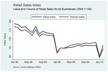
This is good news.  Here is the recent pattern of the All Businesses Index by value and volume.  All the series used here are seasonally adjusted. Click graph to enlarge.
Retail Feb10a
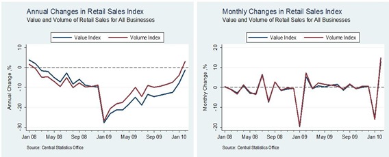
Here are the related annual and monthly changes.
Retail Feb10b
We can see that the annual change in the Retail Volume Index is positive for the first time since January 2008.  Sales by value continue to show a smaller improvement as the total value is dragged down by falling prices.
Looking at the monthly changes we can see there is a dramatic turnaround, following a big fall in January.  Looking back 12 months we can see that this mirrors the pattern seen in January and February last year.  The detail of the monthly changes in the All Businesses Index is largely lost because the of length of the vertical axis needed to include these large swings seen in the January and February figures.
In the early parts of the year the Retail Sales Index is heavily weighted to motor sales as they make up a large proportion of sales.  The recovery of the All Business Index in February is largely driven by the recovery in car sales.
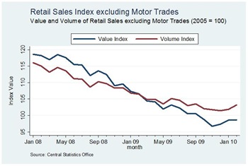
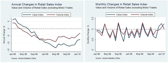
If we look at the Value and Volume indices excluding Motor Trades we see that the volatility present in the first graph above is now absent, but so too is the big upswing for February, though there still is a small increase by Volume in February.
Retail Feb10c
The equivalent annual and monthly changes are shown here
Retail Feb10d
Excluding Motor Sales we can see that Retail Sales are still below where they were last year but that the annual drops are beginning to unwind, particular by volume. 
The interesting feature of the monthly changes is the strong divergence of the Value and Volume indices in February.  For most of the period shown (bar October 2009) we can see that the monthly changes in the two series have a strong positive correlation.  However in February the monthly changes moved in opposite directions. 
When compared with January the monthly change by value fell from +1.3% to +0.1%, while the monthly volume figure increased from +0.4% to +1.3%.  What is important is that all the monthly changes seen in 2010 in these series have been positive.  We are buying more stuff but at lower prices.

Monday, April 12, 2010

Insolvencies continue to rise

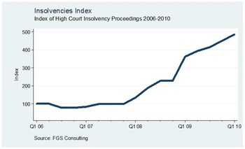
One statistic that didn’t send out a positive message last week was the first quarter report on insolvencies by FGS Consulting.  The figures show that with 469 insolvencies in the first quarter of 2010, this represents an increase of 34% on the 351 recorded in the same period last year.  [In line with Rossa White’s recent discussion of the use of Irish economic statistics it is not clear why an annual comparison of the figures is made.]
However, the report also tells us that there were 435 failures in the final three months of 2009, so the quarterly change is an increase of insolvencies of just under 8%.  Data covering the period 2004 to 2009 are also available from FGS in this report with the Q1 2010 update available here.
Here’s a graph of the index FGS produce
Insolvencies
This is not a pretty picture.  However we should note a couple of things.
  1. Insolvencies are likely to be a lagging indicator.  That is, firms going into insolvency now are there as a result of poor performance of a previous period.  An upturn in economic activity is unlikely to be identified quickly in insolvency data as ailing firms from the recession will still be coming before the courts during the early stages of the recovery.
  2. The data here tell us nothing about the number of employees involved in these insolvencies.  Lots of small firms failing would not have the same impact on the economy as a few large firms failing.
Looking at the Q1 2010 data at a sectoral level, Table 3 tells us that Construction and Engineering accounted for 37.7% of the total.  Retail (16.2%) and Hospitality Services (11.9%) were the other sectors to make up a double digit proportion of the total.  The remaining 34.2% was spread across 12 sectors.
At a regional level Table A1 shows that Dublin accounted for 204 or 43.5% of the 469 insolvencies in Q1 2010, and that this was an annual increase of 56.9% on the figure from the same quarter in 2009.  In contrast, 9.2% or 43 of the insolvencies were in Co. Cork and this was the exact same number of insolvencies in Q1 2009, meaning no increase on the year.

Claims that the Recession is (almost) over!

So believes Davy Economist, Rossa White, in an article in last Friday’s Irish Times.

THE IRISH recession is almost over. That statement may shock some readers as much as the mind-boggling billions needed to fill the crater in our banking system. Yet amid the clamour over the damage wreaked by reckless lending in the past, the recent stabilisation in the economy has received little attention.

Three reasons account for the blind-spot about that improvement: lagging statistics; widespread focus on the wrong metrics; and “feel” versus concrete evidence. First, data on the economy as a whole – National Accounts – are only produced once a quarter. Even then, the figures are way out-of-date, being released almost three months following the end of the reference period ie first-quarter numbers will be available in late June. It is far too late to wait until then to find out what has happened in the economy. As a consequence, many real-time (or virtually real-time) indicators are produced. The latest evidence from those indices for the month of March – the PMI surveys, Live Register and consumer confidence – suggest that the economy is bottoming.

White turns to three measures to provide evidence of an end of the recession:

The Purchasing Managers Index and Consumer Sentiment Index are not ‘real’ in the sense that they are based on surveys of opinions rather than actual data, but they are likely to be strongly related to actual outcome as claimed by Markit Economics for the PMIs.  The only source cited by White based on real data is the Live Register and while there was reduction of 2,300 in February the Live Register showed a disimprovement in March with a seasonally adjusted increase of 600 ‘signing on’.

That is not to say that there is no good news on the economy.  In fact over the past week or so we have identified so positive trends, including:

However, as also noted some of the positive trends have an associated ‘but on the other hand’ to temper our optimism.  There is no doubt that things are getting less worse, but I don’t think we’ve quite ‘turned the corner’ yet.  We’re getting there though.

The Age of the Rockstar Economist is Over

The Age of the Rockstar Economist is (mercifully) Ending

It was good to be an economist - some would even say it was sexy.

But no more.

We've lost interest in the diviners of our economic destiny.

Because not only did most economists miss the crisis, they committed the even more pernicious sin of missing the recovery, essentially taking the Dismal Science to quadriplegic status from its prior condition of being merely hobbled.

Whether the future holds a double dip or an expansion, we've learned that economists' tools and methods will hardly show us the path, let alone provide us with a coherent navigation.

Like Craig Newark, I too missed the memo announcing that this had even begun.

Support Package for Greece

After a few weeks of uncertainty details of the financial support package for beleaguered Greece were finally announced yesterday with more details here.  Ireland will be providing about 1.5% of the total relief, or €450 million out of a total of €30 billion to be made available from the EU, on which Greece will pay an interest rate of around 5%.  The International Monetary Fund are also making about €15 billion available.

Given some of the points we have been making here and here it seems a bit absurd that Ireland should be part of a rescue deal for Greece.

Of course, we don’t have €450 million.  We’re broke.  If (and more likely when) Greece has to turn to this rescue package we will have to borrow this money so Greece can borrow it off us.  Some have suggested that if our borrowing costs are less than 5% we could even make a profit on this bailout.  There are some who were even saying the same about NAMA!

Why will Greece turn to this support?  Even after dropping about 1% from the 7.5% yields of last week, markets still expect to be compensated for taking on the risk of Greek debt.

From today’s RTE report on the Greek crisis:

Meanwhile, the interest rates which Greece must offer to attract loans dropped sharply today.

The rate, or yield, on Greek 10-year debt bonds fell to 6.62% this afternoon from 7.126% on Friday. This remains an exceptionally high rate for a member of the euro zone but is far below the the level of slightly more than 7.5% reached last Thursday when concern that Greece might partly default was running high.

The rate had dropped to 7.126% on Friday after the European Union had said it stood ready to help if asked. The high point reached on Thursday was the highest for any euro zone country since the euro was created.

If Greece went to the markets to refinance their debts they would have to pay something north of 6% to raise the money.  If they fail to do so from bond markets they can fall back on the EU’s €30 billion at a rate of 5%.

Peter Boone and Simon Johnson are clear in what they think will happen

Often assistance packages of this nature just help “smart money” to get out ahead of a default.  This could be the case here; 40-45 billion euro total money could last roughly one year.  Both Russia and Argentina got large packages in the late 1990s but never regained access to private markets, so eventually everything fell apart.

Sunday’s package should make it possible for Greece to borrow short-term but it takes courage to lend for 5 or 10 years to the Greeks unless there is much more fundamental change.

The same two authors have a much longer piece here. Towards the end of this piece there is the following footnote:

(Some people suggest Ireland is an example – however Ireland started with much lower debt levels, and despite large fiscal cuts they are still running a deficit over 10% of GDP that requires annual financing and a rapid build-up of sovereign debt.  Greece could not get these funds in markets, and they will have trouble repaying that new debt just like the old.)

Other believe in us!  On Friday a piece was posted to the BBC website advocating some Irish Lessons for the UK with a previous piece from The Telegraph on What Ireland can Teach us about Spending Cuts.

Friday, April 9, 2010

Core Inflation continues to fall

In line with what we saw back in January the rate of “core” inflation in Ireland continues to fall.  The measure of core inflation used here is the overall CPI rate less the effect of energy products and mortgage interest, both are which are largely externally driven.  Though we are now seeing increases in mortgage rates which are driven by domestic circumstances rather than ECB rate changes.
Anyway looking at the overall and core inflation rates.
Core Inflation
We can now see that the two rates have almost fully converged but they are going in opposite directions.  The rate of core deflation increased from -2.5% in February to -2.8% in March.  In contrast the overall deflation rate eased slightly from -3.2% to -3.1%.
The main reason for this convergence is the unwinding of the swift cuts in ECB interest rates from 4.25% to 1.00% that occurred between October 2008 and May 2009.  The effect of most of these cuts has now been removed from the inflation rate as they occurred more than 12 months ago.  We can expect the mortgage interest inflation rate to turn positive in the next few months, but it is still too early to suggest that the current period of deflation is over.

Dublin Port traffic on the increase

Dublin Port is Ireland’s busiest seaport accounting for 40.5% of imports (by volume) and 43.3% of all exports (by volume) in 2008.  See here.  The Dublin Port Company have recently started issuing statements on monthly traffic at the port.  Thus far we have figures for January and February of this year, with comparisons made to the equivalent figures from last year.  Here is the picture told by the data we have so far.
Dublin Port
The numbers for February are encouraging when compared to the same month last year.
  • Total traffic up 6.4% at 2.15 million tonnes
  • Imports up 3.7% at 1.29 million tonnes
  • Exports up 10.7% at 0.86 million tonnes
Imports give a better indicator of domestic activity than exports and after a slight annual drop in January of -1.9%, the 3.7% increase in February is a positive sign.  It should be noted though that 75% of the goods coming through Dublin Port are destined for a region within a 50 mile radius of the port.  Only a quarter of the goods go beyond The Pale.
We don’t know anything about what categories these goods come from.  Monthly figures for previous years would also be useful to compare to pre-recessions level.   Regardless, this increase must be considered is good news.

Car sales continue to improve

Without much fanfare the Society of the Irish Motor Industry released their car sales figures for March last week.  The figures show a continued recovery in the sales of new cars.  This is good news.
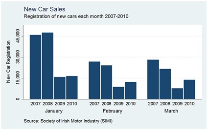
Sales in March 2010 were 78% better than sales in March 2009 (13,813 versus 7,764).   This follows a 39% increase for February and a 5% increase for January.  Here are the monthly sales figures for the first three months of the year for 2007 to 2010.  Click image to enlarge.
Car Sales by Month
The improved performance in 2010 can be clearly seen for February and March.  There has been a 31% increase in new car sales for the first quarter relative to the same period last year. 
This year 42,554 new cars have been registered compared to 32,447 last year, an increase of just over 10,000.  It is true that there are more ‘10’ reg cars on the road.

Industrial Production maintains January gains

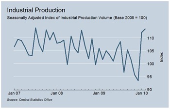
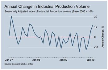
After following a downward trend for two years the CSO’s index of Industrial Production volume jumped up in January.  Provisional February figures were released today and show that the increases in January have been maintained.  Here is a graph of the index for all industries (NACE 0 to 35).  Click graphs to enlarge.
Industrial Production Index
In looking at annual changes production volume in January 2010 was 5.8% higher than in January 2009.  The corresponding February increase is 11.7%.  The annual changes can be seen here.
Industrial Production Change
This is the first time there has been two consecutive months of positive annual change since September 2008.  In 12 of the 15 months beginning in October 2008 the annual change was negative.
This is good news.  But let’s look at the sectors driving this change in a little more detail.
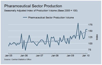
One of the key industrial sectors in Ireland is Basic Pharmaceutical Products and Preparation (NACE 21).  The performance of this sector recently has been exceptional.  Here we have the index of production volume in the since 2005.
Pharma Production Volume
The production index was relatively stable from 2005 through to the end of 2007.  We can see that when the recession took hold from early 2008 that production in the pharmaceutical sector shot up.  Production volume in this sector is now about 50% greater than it was three years ago.  Some of the annual changes are staggering.  What recession?
The pharmaceutical sector is a huge proportion of Irish industrial output.  Using the CSO’s figures the gross value added of all industries (NACE 05-35) in Ireland in 2005 was just under €31 billion.  On its own Basic Pharmaceutical Products and Preparation (NACE 21) accounted for some €10 billion or 32.7% of this.  Using the same 2005 data the sector comprises 36.2% of all manufacturing in Ireland.
These 2005 figures completely underestimate the current importance of the pharmaceutical sector.  Since then we have seen that production in the sector has grown by about 50% since 2008 while production in most other sectors has been in line with the recession and has declined.  I am only guessing but it could be that pharmaceuticals make up about 50% of the total industrial gross value added in Ireland. 
[The Census of Industrial Production would reveal more but it is classified by NACE revision 1.1 rather than NACE revision 2.0 so it would take a small bit of work to reconcile the two.  For our present purposes the 2005 data used to calculate the weights in the Industrial Production release are fine.]
The CSO are being quite laboured in producing employment data for 2009.  Data does not extend beyond the second quarter of last year.  In Table 3 of the Industrial Production release the CSO provide some employment data for the ‘modern' sector.  One row of figures relates to four sectors: chemicals and related products (NACE 20), basic pharmaceutical products and preparation (NACE 21), reproduction of recorded media (NACE 1820), and medical and dental instruments and supplies (NACE 3250).  By gross value added the pharmaceutical sector made up 76.7% of this group. 
If we look at the employment figures for this group.
QuarterNumbers employedChange
2008 Q242,400
2008 Q342,600+200
2008 Q440,900-1,700
2009 Q140,100-800
At a time when the reported level of output has been expanding at a huge pace the number of people employed in the sector has been declining.

Thursday, April 8, 2010

The same but different (for now)

A recent comparison we did here suggested that there was not much difference between the current borrowing positions of Ireland and Greece, except that Ireland is coming from a much lower borrowing base.

Today’s monthly ECB meeting is set to be overshadowed by the Greek debt crisis which say Greek bond yields reach a record high for the euro period.  Here is a graph from Bloomberg of Irish, Greek and German 10-year yields for the past three years.  Larger graph here.

Bond Yields

[If you click the graph you will get through to the Bloomberg app that allows you to create graphs like the above.  The codes for the 10-year bond yields are <GIGB10YR:IND> for Ireland, <GDBR10:IND> for Germany and <GGGB10YR:IND> for Greece.  Paste the code between the < > to “add security”.  Note that the date line on the horizontal axis is not correct and that when you have more than one variable the vertical axis will measure the relative change in basis points (bps) (one bp  = 0.01%).]

The graph here shows the relative performance of the yields on Irish (green line), Greek (yellow line) and German (orange line) bonds for the past three years, i.e. they are all set equal at the start of the period – 9th April 207.  This is actually quite close to reality as back in April 2007 the spread between Irish and Greek bonds versus German bunds was small at just over 0.2%.  These figures are in the following table along with the most figures for April 2010 (11.30am today) from Bloomberg.

  9th April 2007 10-
Year Yield
Premium over Germany 8th April 2010 10- Year Yield Premium over Germany
Germany 4.128% - 3.092% -
Ireland 4.331% 0.203% 4.452% 1.360%
Greece 4.343% 0.215% 7.501% 4.409%

We see that the premium on Greek bonds has soared to nearly 4.5%.  This will have been driven by a drop in the price of the bonds as doubts about Greece’s ability to repay increase.  Irish bonds had a higher yield than Greek bonds up to about six months, but as concerns about Greece began to gather momentum Greek yields have soared in the past six months.  This difference is even more profound in a graph of the relative performances of tw0-year bond yields.  The last six months are crazy and today is the worst yet!

What about Ireland?

On the other hand, Irish yields have been relatively stable over the past six months with little reaction one way or the other to last December’s budget and the recent NAMA and banking announcements.  Irish yields have dropped from their peaks caused by the Deposit Guarantee Scheme (Sep 2008 to 6.025%) and the Anglo Irish Bank Nationalisation (Jan 2009 to 5.872%).  After that there was a fall back to under 5% and there has been little volatility in Irish yields since then.

Although yields are set by the market through the buying and selling bonds they are the key determinant of the coupon to be set on new bonds or borrowings.  If a country issues a 10-year bond at a 5% coupon, the interest they have to pay on that bond will be 5% for the 10 year duration of the bond.  The yield will change as the price people pay to buy these bonds on bond markets change.  However, if the country needs to issue new debt, the coupon on these new bonds will have to be close to the yield on existing bonds if the country is going to find people to take them.

This is the problem Greece finds itself in.  Greece needs to borrow or refinance over €50 billion this year with over €11 billion needed in May alone.  Doing this at rates over 7% will exacerbate the existing problem.  That is if they can find takers for the new bonds.  If they can’t, an EU or IMF bailout of some kind is a certainty and even a default becomes ever more likely.

Looking at Ireland it can be argued that we have been performing relatively well (relative to Greece) in the eyes of bond markets.  The National Treasury Management Agency seem to think so in the press release to mark their third bond issue of 2010.  The Irish 10-year bond was sold at a rate of 4.5%.  This is the interest we are committed to paying over the 10 year life of the bond.  Even if Irish yields were to soar (because the price of Irish bonds falls) we would not be faced with any additional costs on this debt.

As with Greece, the problem will be with new and refinanced debt.  The NTMA are halfway to their €20 billion target for the year.  The stability in yields suggest that if they use 10-year bonds they should be able to raise the remainder at a rate close to the 4.5% of the last bond issue.  Funding the Exchequer deficits we will have over the next five years should also be possible.  Again it could be argued that we are different to Greece.

But with Ireland it is important to look beyond the ‘headline’ figures and look at our ‘off-balance sheet operations’.  This of course means NAMA.

NAMA is being financed with Government bonds.  We are not giving the banks cash for their development loans but are issuing them with Government Backed Securities.  These are different to most government bonds as they have what has been described as a ‘floating interest rate’.  The mechanics of how this interest rate will be determined are vague at best as it does not appear to be a market rate.

Unlike most bonds it seems that it is not the purchaser/holder of the bonds who is carrying the risk.  If there is an increase in yield (fall in price) of a bond I hold, I suffer the loss.  However, the NAMA bonds are being used to support our ailing banks.  If the value of these bonds falls, the value of bonds on the bank’s balance sheet falls (assuming they haven’t sold them on) and the recapitalisation process falls short.  The NAMA bonds are also short-term bonds meaning they will have be re-issued a number of times during NAMA’s lifetime.

If the NAMA bonds had been issued as long-term (10 year) fixed-coupon bonds then it would be bondholders who carry the risk of these bonds falling in value.  In the first instance this would be the banks.  However as they are short-term floating-interest bonds it is the taxpayer who carries the risk of these bonds falling in value.  If this happens, the bonds will have to be re-issued at a higher rate increasing the cost to the taxpayer, exacerbating an already critical debt situation.  Sound familiar?

Tuesday, April 6, 2010

Whose problem is it anyway?

Here’s an update on an old saying, a variation of which is attributed to Lord Keynes.

“If you owe the bank a thousand euro it’s your problem. If you owe the bank a million euro it’s their problem. If you owe the bank a billion euro it’s everyone’s problem.”

Monday, April 5, 2010

The Goldenballs Dilemma

Here’s a short paper that uses the TV show Goldenballs as a natural experiment of the Prisoner’s Dilemma.

Conclusion: Age, gender, occupation and hair colour (!) matter.

There are lots of studies on the importance of age and gender in determining outcomes. Hair colour may be about to join them. See abstract here.

Finally, you can watch a Goldenballs episode that had one of the biggest jackpots played for.  Great viewing.

Saturday, April 3, 2010

Exchequer balance stops getting worse but…

After more than two years of huge deterioration in our public finances, the March Exchequer Return suggests that the Exchequer Balance is finally beginning to stabilise,  i.e. it has stopped getting worse.  It is truly awful but at least the downward spiral seems to have stopped.  The cumulative deficit for the first three months of 2010 is €3,942 million.
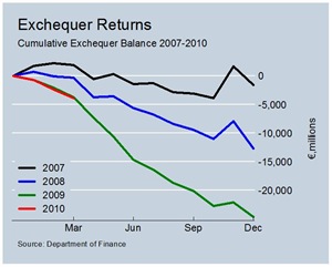
Here we see the pattern of the cumulative Exchequer Balance by month since 2007.  Click to enlarge.
Exchequer Balance
The 2010 (red) line is tracking the 2009 (green) line.  A close up of the figures to March of each year can be seen here
This is not to say that tracking the 2009 pattern is an achievement to laud.  For 2009, the Exchequer ran a deficit of nearly €25 billion.  This was a huge deterioration on the 2008 deficit of just under €13 billion, which itself was a huge fall on 2007 which had a deficit of less than €2 billion.
But at least after two years of rapidly deteriorating Exchequer deficits, there now seems to be a pattern of stability emerging.  The deficit is still 6% larger than it was last this time last year but the rate of decline is easing.   For example, in March 2009 the deficit (€3,721 million) was some 950% greater than the deficit in March 2008 (€354 million).  An annual comparison of the monthly deficits shows that January 2007 was the last month to have a better Exchequer Balance than the same month 12 months previously. The comparison has been negative for the past 39  months in a row.  See table here.
While the deterioration was routinely worse than a 100%, and oftentimes much more, the figures for the first three months of this year are –4.4%, –15.5% and –5.9%.  The rapid expansion of the Exchequer Deficit is easing.  With tax revenues continuing to fall, much of this stability has been brought about with moderation in expenditure.
A table with a comparison of the monthly Exchequer Balances is available here.  Although the monthly figures do contain a lot of noise we can see that the deficit in March was actually €102 million or 6.2% less than in was in the same month in 2009.
Here comes the but….
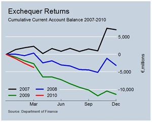
If we disaggregate the Exchequer Balance to its Current and Capital components we see that there is continued deterioration in the Current Budget Deficit.  Click to enlarge.
Cumulative Current Account BalancesA snap-shot of the patterns to March can be see here.  The cumulative Current Budget Deficit in March (€3,706 million) is over 40% worse than what it was at this time last year (€2,613 million). And for March alone the Current Budget Deficit is over 50% worse than it was in the same month last year.  This is not good.
Tables of the cumulative Current  Budget Deficits and the monthly Current Budget Deficits are available. 

Friday, April 2, 2010

Fall in tax revenue eases slightly

The March Exchequer Returns have just been published and allow us to update our analysis of tax revenue from February.  In a statement released with the return, the Minister for Finance has indicated his satisfaction with the figures.
“At end-March, €7¼ billion in tax receipts has been collected, some 3½ per cent behind profile for the period and 15 per cent below what was collected in the first quarter of 2009. However, a substantial year-on-year decline had been anticipated in the early stages of 2010 and for the year as a whole, the Budget day forecast of €31 billion, which represents a 6 per cent year-on-year decline, is still a valid target. The widely held view is that the economy will return to growth in the second half of the year and this should improve tax performance.”
In looking at the March tax figures we can see that the 15% drop for the first three months of the year represents a fall in revenue of €1,274 million below the amount collected in the same period last year. 
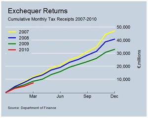
We can examine the pattern of tax receipts since 2007 with a graph that tracks cumulative tax receipts by month.  Click the graph to enlarge.
Monthly Tax Revenues There is now a gap emerging between the 2009 (green) line and the 2010 (red) line.  See close-up here. Similar graphs are also available for the main tax heads.  Click to view.
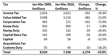
The graphs show that corporation tax revenue is very low and is down 73% on last year, with very little preliminary tax paid.  Relative to last year the best performing tax is Excise Duty (-1.8%).  The complete collapse in stamp duty and capital gains tax revenues relative to 2007 and 2008 is also evident.
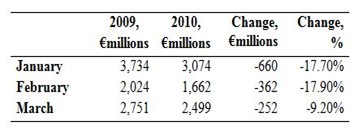
Returning to the total tax take for 2010, the annual rate of decline eased somewhat in March.  After rates of 17.6% and 17.9% in January and February, the March 2010 was ‘only’ 9.2% below the corresponding figure for March 2009.  Here are the monthly tax revenues in millions with the associated annual changes.Tax OutturnsWe can also look at the forecasts made by the Department of Finance back in February. No monthly forecast of January tax revenue was made.  Tax Forecasts2We see that the outturn has fallen below the Department’s forecast for each of the last two months and that the forecast error increased from 3.7% in February to 7.5% in March.
Looking at the individual tax heads we see how the overall drop of 15% varies across the different headings.  The double-digit drops in both income tax and VAT give rise for concern.Tax Revenues MarchThe monthly equivalents for March 2010 and March 2009 are available here.  There even are some positive signs used in the table!  The performance of the individual taxes relative to the Department’s forecasts can be seen here.
The strongest performing tax is Excise Duties – up 12.1% on the same month last year and only down 1.8% for the year.  We don’t have the breakdown of revenue by excise duty.  Excise duties on oil (38.8%), tobacco (20.9%), alcohol (19.1%) and Vehicle Registration Tax (20.0%) are the main sources of revenue (using 2008 figures). 
The relatively good performance of Excise Duties in 2010 is probably down to changes in the rates applied rather than any improvement in activity.  Revenue will have increased because of the introduction of the carbon tax in last December’s Budget, though this will have been offset somewhat by the reduction in duties on beer and cider.  The effect of the €1,500 VRT rebate is also unknown.
For 2010 as a whole the Department predict that tax revenue will fall by €1,993 million.  In the first three months of the year there is already a drop of €1,274 million or 15% below the amount collected in the first three months of last year.  Tax revenue for the next nine months can only be €719 million or 3% below the amount collected in the last nine months of last year.
There will have to be a substantial improvement from the 15% drop we have seen so far this year if this target is to be met.   The monthly rate of decline has eased to 9.2% and the Department are forecasting that this will continue with a 4.9% drop forecast for April.
How will our forecast of a 7.2% lower tax revenue for the rest of the year fare out?

Thursday, April 1, 2010

Irish banks are hugely profitable

In the midst of the disaster that is the Irish banking failure, it is useful to note that Irish banks are hugely profitably businesses on an day-to-day or operating basis. 

Irish banks are not losing money and are generating big profits.  The problem is that Irish banks lost absolutely vast amounts of money when they issued huge loans to developers that they have no chance of getting back.  These losses are only now being addressed and are threatening to drown this country.  Any profits the banks are making are small in comparison to these huge losses but there are profits there nonetheless.

If we take the most recent financial reports for some of our main banks.

Bank

Operating Profit

Reported Profit

Allied Irish Bank

€2,962 million

-€2,656 million

Bank of Ireland

€1,050 million

-€1,469 million

Anglo Irish Bank

€636 million

-€12,709 million

Ulster Bank

£281 million

-£368 million

These four banks reported operating profits of close to €4 billion.  We already own one of them (Anglo), are well on the way to owning another (AIB) and have a sizeable stake in a third (BOI).  On this basis owning these businesses is not a bad thing.

However, the process of owning these has seen us commit almost €75 billion to cleaning up their appalling balance sheets: €45 billion for NAMA and €30 in recapitalisation.  The annual profits outlined above will not even be enough to cover the annual interest charges on the huge debt burden we are creating with our ‘solution’ to this mess.

Our banks may be profitable but it is lose/lose for us.  We are losing money to the banks whose profits are so high only because their charges are so high.  We are losing money to the world to pay the interest on all this debt we are creating so that these banks can survive.

Details of the figures used above are given below the fold.

The operating profit figure for Allied Irish Bank is on slide 9 of this presentation.  AIB made a bad debt provision of over €5 billion that turned the operating profit into a reported loss of €2.6 billion.

Bank of Ireland recently published preliminary nine month results for the period ending 31 December 2009.  On page 11 of this report we see the operating profit of just over €1 billion for the period.  BOI’s bad debt provision was €4 billion. A tax credit for €344 and a gain on the repurchase of liabilities of just over €1 billion, gave BOI a reported loss of  €1.469 billion.

Anglo Irish Bank reported 15 month results for the peri0d to the end of December 2009.  Anglo actually made an operating profit of €2.394 billion in this period as per page 38 of this report.  However €1.758 billion of this was due to the profits on the non-recurring purchase of financial liabilities.  Removing this we get the €636 million figure used above.  Anglo’s bad debt provision was nearly €15 billion, resulting in the bank reporting the largest loss in Irish corporate history.

Ulster Bank is part of the Royal Bank of Scotland group and is not part of the NAMA process.  The 2009 results for the bank are on page 70 of this report.  Ulster Bank’s operating profit of £281 million is wiped out with a bad debt provision of £649 million, giving the reported loss of £368 million.

 
Unsecured Loans Proudly Powered by Blogger