Thursday, March 31, 2011

Stress and sustainability

The number is out. The banks require another €24 billion of recapitalisation but we may not need to borrow a cent of it.

In a previous post we examined that debt sustainability of the State taking on additional banking-related debt if the bank recapitalisations required the full €35 billion set aside under the “worst case” scenario in the EU/IMF deal.  The conclusion was:

Let’s assume that the “adverse scenario” of the stress tests matches the “worst case” scenario of the EU/IMF deal.  This means a further €35 billion going to the banks, bringing the total cost of the bank bailout up to €81 billion.  Adding the additional €17.5 billion of borrowings that this requires to the existing €35.6 billion of borrowings used for the banks so far means that we will have a €53 billion millstone of bank-related debt weighing us down (as well as the elimination of €20 billion of sovereign savings and the reduction of €7.5 billion in our cash balances).

This €53 billion of debt is sustainable (with sustainable being defined as the ability to avoid default).  We could carry this debt and service the interest.  It is hard to see how we can actually pay it off but having it is unlikely to tip us into default. 

We now know that four of the six banks require an additional €24 billion in recapitalisation funds so this reduction of €11 billion will make the sustainability of this debt even more likely.  But we also learned a few more things.

Irish Life and Permanent requires €4 billion.  According to a statement issued by the company €1.1 billion of this will come from the sale of Irish Life with another €0.6 billion coming from existing company resources.  The State will make up the €2.3 billion shortfall, but will not need to cover the entire €4 billion.

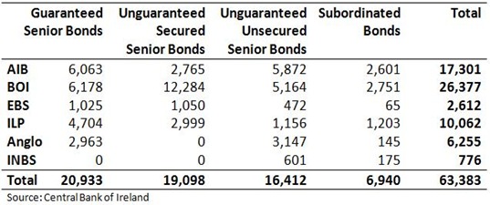
In an interview on RTE’s Six One News, the Minister for Finance, Michael Noonan indicated that part of the cost would be carried by subordinated debt holders.  We looked the numbers in a previous post.  Here is the table again.

Bonds in Covered Banks

The issue of burden sharing is raised 2:50 into the clip that features the Noonan interview on this page.

Per the ECB the first two columns cannot be touched.  Noonan was questioned on the €16 billion of unguaranteed unsecured senior bonds but said there would be no burden sharing here either.  (Though he did suggest this may be returned to in the case of Anglo and INBS may more details of their wind downs are revealed in May).  Anyway, when discussing the subordinated bonds in all the banks he said:

“We can burden share in subordinated bonds and that will give us between five and six billion of the €24 billion.

Six billion is probably a slight exaggeration but a 70% haircut would knock €4.9 billion off the banks’ liabilities and is achievable.

We already knew that €10 billion of the funds would come from the further destruction of the NPRF.  Also, as part of the EU/IMF deal the State was going to have to provide an additional €7.5 billion from the existing €15 billion of cash balances held by the NTMA.

So all told, to get this €24 billion.

  • €1.9 billion will come from the existing assets of Irish Life & Permanent
  • €4.9 billion will come from burden sharing with subordinated bond holders
  • €10 billion will come from the National Pension Reserve Fund
  • with the final €7.2 billion coming from existing cash reserves.

This phase of the recapitalisation could be financed without any recourse to additional borrowing.  The debt that has been created by the earlier rounds of the recapitalisation process is €35.6 billion.  This process is a colossal waste of money but this is a debt burden that a country with a GDP of €153.9 billion can carry.  As before, default is an option not an inevitability.  The important things now are to draw a line under this banking fiasco and to get the public deficit under control.  There is still some doubt about our ability to attain either.
For the day that’s in it

More self-held bonds?

The February release of the Credit, Money and Banking Statistics does not show too many new or surprising patterns (are we normalising the abnormal).  The previous post looked at central bank borrowings which increased again in February.  Here we will give a quick look at the bonds issued by the covered banks.

Covered Bank Bonds

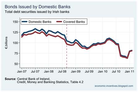
The amount of bonds issued by the 20 domestic banks and the subset of the six covered banks are virtually identical as the non-covered domestic banks issue virtually no bonds in Ireland.  We can see that the amount of bonds outstanding fell dramatically once the original guarantee expired in August but has risen substantially in the past two months. 

Who holds these bonds?

Holders of Covered Bank Bonds

The trend of increasing Irish ownership of the covered bonds continues and it is only holdings by Irish residents that increased in February.  What other institution resident in Ireland would be foolish enough to take on additional bank bonds? None.

It is the banks themselves that are holding these “bonds”.

Irish Securities held by Covered Banks

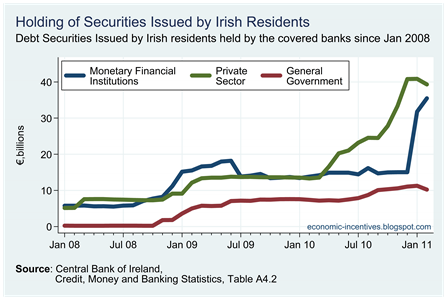
The balance sheet of the covered six now includes €85 billion of bonds issued by Irish residents.  There is €10.3 billion of government bonds, €39.3 billion of private sector bonds (75% of which are from NAMA) and €35.5 billion of bank bonds.

We know that the banks issued €17 billion of bonds to themselves in January.  It is likely that the February increase of €3.7 billion was also down to these activities.  That still leaves about €15 billion of bonds from Irish banks on the covered six balance sheets. 

The covered six are the only significant issuers of bonds among all Irish banks.  We have seen some instances of cross-holdings of the bonds by PTSB and Anglo but full picture of these cross-holdings has not emerged.

Finally it was presumed that these self-issued bonds would reduce the reliance of the banks on the ELA from the Irish Central Bank.  As we have just seen that did not happen as ELA funding rose €20 billion and ECB funding fell €6 billion.  Just what are these self-issued bonds being used for?

Central Bank reliance rises to €153 billion

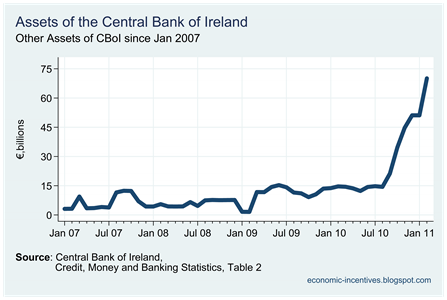
About a week ago the Central Bank published an update of their balance sheet for February.  This shows that ‘Other Assets’ which is primarily made up of Emergency Liquidity Assistance (ELA) to the Irish banks had unexpectedly increased from €50.1 billion to €70.1 billion.  To get a complete picture of the reliance of the Irish banks on Central Bank funding this figure needed to be added to the monies the banks have accessed directly through the ECB.

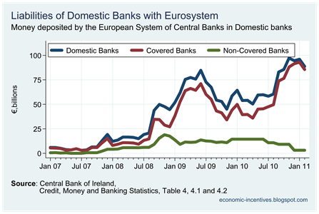
In January this was €93.0 billion, giving a total of about €140 billion (not all of the ‘Other Assets’ category is ELA).  Figures released this morning put the February liability with ECB at €85.6 billion,  which puts the total amount borrowed from the central banks at somewhere around €153 billion.

Here are ECB liabilities of domestic banks since the start of 2007.

Eurosystem deposits to covered banks

And here’s the scary one – the Central Bank’s ‘Other Assets’.

Central Bank Assets2

IL&P and bonds in the covered banks

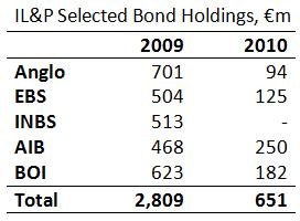
In the comments of this post we are directed to the 2010 annual report for Irish Life and Permanent (H/T Lorcan Roche Kelly via hoganmahew).  As has been speculated during the week it seems likely that the group will be broken up with Irish Life and Pensions sold and Permanent TSB nationalised.  Anyway our interest here is the holdings of bonds by IL&P in the covered six which we previously looked at here.

The latest report gives a much more detailed insight into this issue.  The report can be read here and the information we’re looking at is from page 218 which gives details of the links between IL&P and the covered banks at the 31st December 2010.

ILP Bonds

There’s a lot of change going on there!  We also know that IL&P actually held €886 million if Anglo bonds on the 30th June 2010 so it was quiet a fall to have this reduce to just €94 million at the year end.  All told the exposure of the group to bonds of the other covered banks reduced by nearly €2.2 billion during the year. 

It is not clear if the bonds matured, were redeemed or were sold on to other third parties.  It is also not clear which part of the IL&P group holds the bonds – the pensions business of Irish Life or the banking business of Permanent TSB.  Regardless, it is a reasonably positive development (although the money to repay the bonds could now be owed to the ECB) and hopefully is reflective of a general pattern across the covered six that has been them reduce their exposure to each others’ debt.

UPDATE: The 2010 Annual Report for Anglo Irish Bank was released this morning.  It can be read here.  It does not seem to provide the same detail as the IL&P report.  On page 158, though there is the following paragraph:

In addition, in the normal course of business and on arm's length terms, the Group has entered into transactions with Government-related entities, which include financial institutions in which the State has significant influence. The principal banking transactions include taking deposits, investing in Government bonds and debt securities in issue, and providing loans. At 31 December 2010 normal banking transactions outstanding between the Group and such entities amounted to: deposits of €540m (31 December 2009: €436m), Government bonds of €278m (31 December 2009: €1,118m), debt securities issued by State-owned financial institutions of €383m (31 December 2009: €232m), loans and advances to banks of €365m (31 December 2009: €356m) and customer loans of €nil (31 December 2009: €173m).

At the end of 2010, Anglo held €383 million of bonds from other “state-owned financial institutions.  Not massive, but significant nonetheless.

Tuesday, March 29, 2011

Contributions to the Growth Rate

Last week’s Quarterly National Accounts release allows us to look at the contributions made by the components of GDP to the growth rate.  This is the domestic economy (C + I + G) and the balance of trade (X – M).  Here are the real quarterly GDP growth rates since the start of 2008.Quarterly Real GDP Growth

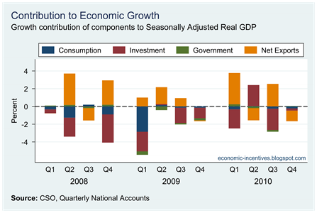
We can see that the quarterly growth rate has been negative for 10 of the past 12 quarters.  Here are the contributions of the individual components of GDP to the growth rates over the same period.

Contributions to Real GDP Growth

The stand out colours are the maroon of investment (mainly on the downside) and the orange of net exports (mainly on the upside).  Consumption did have a significant negative contribute to the growth rate but this has reduced since the middle of 2009.  The direct effect of government is quite small but is mainly negative.  Government expenditure will have indirect effects on GDP through the effect transfer payments have on consumption.

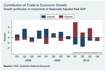
We will focus on the two largest contributors to the recent growth rates – net exports and investment.   Here are the contributions of the components of net exports, exports and imports.

Contribution of Trade to Real GDP Growth

In 2008 and 2009 it is evident that the positive contribution of net exports to the GDP growth rate was coming from imports – falling imports.  During this period exports were falling as can be seen but this was outweighed by the greater fall in imports.  With intermediate goods for production (materials and capital) making up about 70% of Irish imports this was not a positive development for the economy even though it had a positive effect on the growth rate.

It is only in 2010 that the contribution of trade to the growth rate has been the result of rising exports.  During this time imports have also been rising, represented by the negative contribution of imports in 2010 but these are now outweighed by the rise in exports.

The National Accounts do not provide us with any breakdown of the Investment total provided.  This category is made up of capital formation of households (mainly buying houses) and firms, and capital expenditure by the government.  We can get some insight into the patterns of these from the Non-Financial Institutional Sector Accounts.

These data are nominal and only available annually (though there has been a suggestion from the CSO that quarterly updates may be provided).  Data are available from 2002 to 2009 and it will be October before the 2010 data are published.  Here are the annual contributions of household, firm and government investment to the nominal GDP growth rate since 2002.

Contribution of Investment to Growth

The biggest contributor is the household sector which comprises mainly investment on houses.  In 2009, the investment of all three sectors contributed negatively to the growth rate.  This is likely to have continued in 2010.

Finally, for investment the CSO also publishes a breakdown of investment by use in Table 15 of the National Income and Expenditure Accounts.  Not surprisingly, house building has had the largest effect on the growth rate (again in current prices).

Investment Contributions to Growth

Monday, March 28, 2011

February Retail Sales

The CSO have just released the February Retail Sales Index.  The big jump reported in January was not maintained and retail sales by value and volume slipped back again in February. 

As per usual, we will focus on the sales index that excludes motor sales.  The overall number for February is very heavily skewed towards the motor trade which makes up 33% of the index in February.  Another reason to exclude the motor trade is because it includes the full value of all cars sold.  From a household point of view, the decision to purchase a car will be made on the difference between the cost of the car purchased and the trade-in value of the car sold.  Anyway here are the numbers.

Ex Motor Trades Index to Feb

Only some of the January gains were given up, but the volume index is still lower than it  was in November.  The value index has performed somewhat better, and apart from January, is at a higher level than very month since September.  This is likely influenced by the end of the deflation measured by the CPI.

Although changes to recent months are positive on an annual basis retail sales are still down on last year.

Annual Change Ex Motor Trade Index to Feb

Since July 2008 there has only being one positive change in either annual change series (the volume index in April 2010).  Over recent months both series did get close to breaking into positive territory but fell away each time.  It is clear that the huge slow down in consumer spending seen in 2009 has eased, but all we have it apparent stabilisation rather than real recovery.  February was the first month where the volume series showed a  significantly lower annual change than the value series.

The monthly changes are a bit more volatile and reflect adverse weather in December, early January sales and other factors.

Monthly Change Ex Motor Trade Index to Feb

Sunday, March 27, 2011

Some numbers on the Irish Economy

Here are ten interesting (to me at any rate!) statistics about the Irish economy.  Follow the links to read the posts that examined these ten issues.

The Top 10 and the National Accounts

The release this week by the CSO of the first estimates of GDP and GNP for 2010 generated some commentator interest.  We looked at some reasons behind the rising GNP figures and why nominal GDP fell by 6.4% on the quarter.  One thing that has to always be remember when looking at the Irish National Accounts is the impact of a small number of large companies.

According to the CSO, the 10 largest exporting MNCs accounted for 34% of the total value of Irish exports in 2009.  These same companies account for 33% of imports.  In 2009, exports were €144.8 billion and imports were €120.4 billion.  The top 10 accounted for €49.2 billion of exports and €39.7 billion of imports.   Not surprisingly this is more that one-third of net exports and but also was nearly 6% of total GDP.

The sum of the imports and exports of these 10 companies was equivalent to 55.6% of GDP.  It is clear that any changes in the activities of these individual companies will have significant effects on the overall figures.

Who holds Irish bank bonds?

We have made a number of attempts to use Central Bank data to determine the ownership of bonds issued by the Irish banks.  Here are links to some of the posts.

Most of this analysis is at a high level and reaching exact conclusions are difficult.  Getting information to verify these conclusions is even more difficult.  Here is one titbit that ties in with the first claim made above – that the covered banks themselves are substantial holders of bonds in the covered banks.  It comes from Irish Life and Permanent 2009 Annual Report that was released last March.  The bottom of page 209 contains the following:

As at 31 December 2009, debt securities includes €701m (2008: €330m) of securities issued by Anglo Irish Bank and loans and receivables to bank includes loans amounting to €375m (2008: €262m) issued to Anglo Irish Bank.

We don’t have any more recent info but this is only one of the 15 possible inter-relationships between the six covered institutions.  The plural of anecdote is not data and in this case we only have a single source (that is now 15 months redundant) but it does confirm that there is at least some cross-holdings of bonds between the covered institutions.

UPDATE:  From the comments we are directed to the 2010 Interim Report for IL&P (HT yoganmahew).  It can be read here.  Jump to page 97 and we have an update:

As at 30 June 2010, debt securities includes €886m (30 June 2009: €328m, 31 December 2009: €701m) of securities issued by Anglo Irish Bank  and loans and receivables to bank includes loans amounting to €282m (30 June 2009: €nil, 31 December 2009: €375m) issued to Anglo Irish Bank.

Between the end of December 2009 and the end of June 2010, IL&P acquired even more Anglo bonds!

Thursday, March 24, 2011

What happened to current price GDP?

Here’s another one from today’s Quarterly National Accounts release from the CSO.  There seems to have been a huge difference in the current and constant price measures of GDP.

GDP at Current and Constant Prices

We can see that a gap between these series emerged in the latter part of 2008 as deflation dragged the current price GDP series down faster than the current price series.  This gap stabilised in the middle of 2010 and it appeared that the period of price deflation was beginning to unwind – at least this is what the Consumer Price Index shows.  See here.

So what on earth happened in Q4 2010 that caused such a huge fall in current price GDP?

Current price GDP for 2010 at €153.9 billion was 3.6%  below the €159.6 billion recorded for 2009.  The Q4 2010 quarterly current price GDP of €36.9 billion was 4.7% below the same figure in 2009.  In seasonally adjusted terms the Q4 current price GDP was down an incredible 6.4% on the Q3 figure.

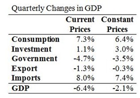
It is hard to explain the large difference between the quarterly growth rate of current price GDP and constant price GDP.  Here are the quarterly changes for each component of GDP.

Quarterly Changes

There are some differences but nothing sufficient to account for the 4.3 percentage point difference in the overall growth rates.  It may be due to the chain link process that is used to create the constant price index which is carried out independently on each element.  So maybe the questioned shouldn’t be “what happened to current price GDP that it fell by 6.4%” but instead should be “what happened to constant price GDP that it only fell by 2.1%”.

The current price series is additive and adding the changes of the individual components does give a change of –6.4%.  The constant price series is not additive but adding the effect of the better changes (that is, better than the current price series) in investment, government, exports and imports to the worse change in consumption would have given a drop in current price GDP of 4.5%. 

This sort of gap between current and constant price GDP changes would be reasonable enough in a time of deflation.  Consumer price deflation was beginning to unwind towards the end of 2010 (post here) so that is not a viable reason.  It seems we’ll have to leave this to the stats techniques employed by the CSO.  The same happened to GNP but the effect was not as visually dramatic.  See graph here.

Finally, when looking at the growth rates of the individual components it is interesting to note the big jumps in consumption expenditure.  This should not be taken as the consumer getting back into the market.  The final quarter (and particularly the run-up to Christmas) is the most important time of the year for retail sales. 

The seasonally adjusted figures take account of this expected bump.  On a seasonally adjusted basis current price consumption fell by 0.9% compared to Q3.  In constant prices the fall was only 0.1%.  This is largely borne out by the retails sales index which shows that both the value and volume indices were falling in the last three months of the year.  See post here

Digging down on our rising GNP

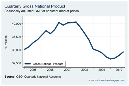
One of the notable features of the recent quarterly national accounts has been the upturn in GNP as show below.

Quarterly GNP

GNP has now grown quarter-on-quarter for the past three quarter.  This was not enough to generate an yearly increase and 2010 GNP of €135.3 billion was down 2.1% of the €138.2 billion recorded in 2009.

The difference between GDP and GNP is ‘Net Factor Income from Abroad’.  This is the balance of income abroad that is repatriated to Ireland and income in Ireland that is repatriated abroad.

Net Factor Income from Abroad

Towards the end of 2009 nearly €8 billion more was leaving the economy.  It can be seen that by the end of 2010 this has fallen rapidly and in the final quarter of 2010 just over €6 billion left the economy in seasonally adjusted terms.  The upturn in the non-seasonally adjusted series is even more dramatic. See graph here

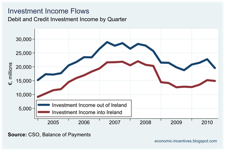
To see the actual amounts that underline this net amount we can see the flows of money from the balance of payments.  With labour compensation flows being very small the key variable is investment income.  Here are the investment income flows in and out of Ireland.

BoP Investment Income

This investment income is further divided into direct investment income, portfolio investment income and other investment income.  Although the latter two of these are significant there has not been much volatility in these series recently.  The main changes has occurred in direct investment income.

BoP Direct Investment Income

The big drop in outgoing factor income in the latter half of 2010 can be seen here, though it also apparent that the current quarterly level is close to the average seen in the period since 2005.  The greatest portion of direct investment income is income on equity.  The flow of equity income is divided between “dividends and distributed branch profits” and “reinvested earnings”.

BoP Dividends and Reinvested Earnings

In the early part of the series there seems to be a strong negative relationship between the two.  When dividend outflows are large, reinvestment outflows are small (and were even negative when dividend outflows peaked in 2005).  In the last two years this relationship has broken down.  It appears that outflows from reinvested earnings in late 2009/early 2010 were higher than would have been the case had this apparent relationship held.  This increase in reinvested earnings outflows was not maintained and there was a big drop towards the end of 2010.

Could it be that the surge in reinvestment earnings outflows up to the middle of 2010 over-stated the true drop in GNP and that the fall in these over recent quarters has seen a more accurate reflection of Irish GNP?  That is, things may not have been as bad we thought they were for 2009 GNP figures and things now may not be as good as they appear to be for 2010 GNP figures.  Just a thought.

What this highlights is the major effect a small number of massive multinationals have on Ireland’s National Accounts.  Remember the stat that 10 companies account for 34% of total Irish exports?

Update: The CSO give a related explanation in the QNA release.

On the Expenditure side the decline in net exports of multinational companies compared with the third quarter resulted in a substantial decrease in profits thereby reducing the overall net factor outflows and feeding in to the quarterly GNP increase of 2.0 per cent.

They know more about the activities of the multinationals through their ‘large case unit’ they can publicly release.  Therefore we will have to accept the link between the “decline in net exports” and the “substantial decrease in profits”.  Rising GNP should be a good thing but not if it comes from falling net exports and profits.  The impact of a small number of the large multinationals on out national accounts is huge.

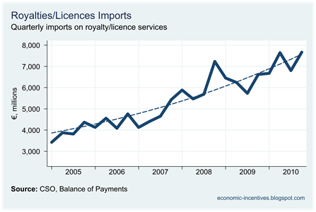
Could the decline in profits have anything to do with this?

Royalty-Licence Imports

Q4 2010 Quarterly National Accounts

This morning the CSO released the Q4 2010 Quarterly National Accounts.  These allow us to gauge economic performance for the whole of 2010 for the first time.  These come with a small health warning.  When the 2009 preliminary GDP figures were released this time last year, the figure was €3 billion higher than the final GDP figure that was released in June.

Anyway, here goes with the most recent figures in this set of graphs.  As per usual Slideshare has skewed the left of the graph and the vertical axis label is missing but it should be self- explanatory in most cases.

Tuesday, March 22, 2011

One domestic consequence of default

With talk of “unsustainable debt” and “inevitability of default” growing ever louder I think the following graph from a previous post is important.  While much of the noise has focussed on the liability side of our ailing banks this looks at some of the assets they hold, and in particular assets issued by Irish residents. 

Irish Securities held by Covered Banks

Irish exposure to Irish debt is getting ever larger.  The full implications of a banking- and/or sovereign-debt default need to be examined and this is something that those who are shouting loudest tend to ignore.  Here is the blurb that went with the graph.  This is a point that should not be lost.

The covered banks are holding more and more debt securities issued by Irish residents.  These have increased from €11 billion in January 2008 to €84 billion in January 2011.

Everything is going up.  The increase in “private sector” bonds here are mainly those issued by NAMA in return for the transfer of developer loans from the banks.  Bonds by “monetary financial institutions” are bonds issued by the covered banks themselves.  The almost vertical rise seen in January 2011 is because the banks issued €17 billion of bonds to themselves to use as collateral with the ECB.  As we saw previously, the remainder of this category is €15 billion of bonds the covered banks hold in each other.  Burning these bondholders will just mean more promissory notes will have to be issued.

I cannot really explain the rise in the holdings of “general government” bonds by the covered banks.  It seems unusual that at a time when the State was pumping billion to prop up the banks, these very same banks were using €11 billion to buy bonds issued by the State.  It appears they now hold about one-eighth of Irish government bonds in issue.  Guess who will be hit if there is a sovereign default??

Some insight into the banks’ buying of Irish government bonds is given in this May 2009 article from the Sunday Business Post.

Monday, March 21, 2011

National Pension Funds

From here:

TOKYO, March 22 (Reuters) - Economics Minister Kaoru Yosano said on Tuesday that Japan should not tap funds said aside for pension payments to fund disaster relief efforts.

"It is undesirable to use pension funds as a source of money for disaster relief, as it would destroy the basic principle of a pension fund," Yosano told reporters after a cabinet meeting.

This puts our use of the NPRF into perspective.  And Japan has a debt-to-GDP ratio of more than 200%.

Sunday, March 20, 2011

What is sustainable?

The sustainability of Irish debt has come more and more into the spotlight.  Outside of the sphere of political institutions the view that Ireland’s debt are unsustainable is becoming an ever more dominant viewpoint.   The blame for this unsustainability is being directed at the bank debt which is being heaped onto Ireland’s public debt.  A recent Primetime show highlights this view (starts 10:15 in).  The full interviews with the contributors to the show are posted here and are also worth watching, particularly that by Prof. Philip Lane of Trinity College.

So, is the banking-related debt we are assuming sustainable?  On examination it turns out that it might be.

So far, €46,279 million has been poured into the banks.  This is made up of

  • €4,675 million via the Exchequer with 
    • €4,000 million going into Anglo Irish Bank
    • €575 million into EBS and
    • €100 million into INBS;
  • €10,700 million via the NPRF with
    • €3,500 million in AIB preference shares and
    • €3,700 million in AIB ordinary shares
    • €3,500 million in BOI preference shares; and
  • €30,904 million through Promissory Notes with
    • €25,354 million going to Anglo Irish Bank
    • €5,300 million to INBS and
    • €250 million to EBS.

Of this €46.3 billion, €35.6 billion is with borrowed money, with the remainder coming from the savings built up in the National Pension Reserve Fund (though it is possible to argue that the €4.7 billion contributed to the fund since 2008 was also borrowed).

The great unknown is how much more money will needed to prop up these banks.  The EU/IMF deal has a “worse-case” scenario of a further €35 billion needed to complete the cleansing of losses from the viable banks and the wind-down of the zombie banks that Anglo and INBS have become.  This €35 billion comes from three sources:

  • €10 billion of the remaining balance in NPRF, 
  • €17.5 billion borrowed from the EU/IMF package, and
  • €7.5 billion from other State resources (there were c. €12.3 billion of available cash balances as of 31/12/2010.  See third paragraph here.) .

The new Minister for Finance, Michael Noonan has indicated that the further recapitalisations will be greater than the €10 billion to be taken from the NPRF, and we will require some of the EU/IMF contingency fund for the banks.  

To find out how much we will have to wait until the stress test results are published at the end of the month.  We can only hope that these finally paint the full picture and we don’t get the ridiculous situation of last year with AIB passing the stress tests only to need further recapitalisation a few months later.  We need these to tell what the worst possible outcome is to see if continuing with the bank bailout is indeed sustainable.  The fact that finally publishing this is also in the interest of the new government lends some hope.

Let’s assume that the “adverse scenario” of the stress tests matches the “worst case” scenario of the EU/IMF deal.  This means a further €35 billion going to the banks, bringing the total cost of the bank bailout up to €81 billion.  Adding the additional €17.5 billion of borrowings that this requires to the existing €35.6 billion of borrowings used for the banks so far means that we will have a €53 billion millstone of bank-related debt weighing us down (as well as the elimination of €20 billion of sovereign savings and the reduction of €7.5 billion in our cash balances).

This €53 billion of debt is sustainable (with sustainable being defined as the ability to avoid default).  We could carry this debt and service the interest.  It is hard to see how we can actually pay it off but having it is unlikely to tip us into default.  Of course,we have another reason for our soaring borrowings that also needs to be addressed.   Why is this €53 billion of debt sustainable?  If we assume an interest rate of 5.7% this would require €3 billion a year just to pay the interest – about 1/12 of Exchequer tax revenue. 

However, we must consider what we get for this €53 billion of debt – six banks.  All that can be done with Anglo and INBS is a wind down and we can forget about ever seeing any of the huge sums of money that has been swallowed by them.  EBS may have some value but nothing significant.  It is unclear what the State’s holding, if any, in PTSB will be.  The State will own AIB and BOI.

Amazing as it may seem on an operating, or day-to-day basis, these banks are actually profitable.  The banks’ balance sheets are an unholy mess but anyone who has a current account, business account, cheque book, overdraft, or credit card will be fully aware of the level of charges, interest rates and referral fees charged by the banks.  These were the bread and butter of the main banks before they got dizzy chasing the shadows of Anglo around the Irish property-development bubble.  These day-to-day profits still exist but are completely dwarfed by the losses on the banks’ balance sheets.  The most recent figures show that for the first six months of 2010:

  • AIB made a pre-tax operating profit of €976 million (see slide 5)
  • BOI made a pre-tax operating profit of €553 million (see page 4)

These operating profits were eliminated by impairment charges and other balance sheet adjustments.  If considered over a full year these operating profits would total around €3 billion.  As the dominant shareholder the State would be entitled to a significant dividend on these profits (once most of the impairments and loans losses have been washed through).  These profits will NEVER cover the losses the six banks have made but they can be used to offset some (though probably less than half) of the annual interest cost we are incurring from covering these losses.

Indeed, if the €81 billion package manages to make good most of the immediate losses in AIB and BOI, it is likely that the banks can be sold on at a price.  Again, this will only cover a fraction of the money pumped into them.  It might be possible to get €4 billion for reasonably cleaned-up versions of the two main banks.  Using this would bring the debt legacy of this ill-constructed bank bailout down to €45 billion, a figure which is unlikely to push us over the precipice of a sovereign default, though it is also unlikely we will ever pay this debt down.

Of course, just because something is sustainable is not a reason to proceed with it, and could not be used as a justification to reject “burden sharing” with bank bondholders.  An element of burden sharing would further reduce the residual debt left by this banking meltdown but it is important to note who these bondholders actually might be.  And we cannot forget the gains or losses that will result from the NAMA process or the money owed to the ECB that is now keeping the banks open and funding the customer loans they have issued.

Regardless, I think an €81 billion bank bailout package is sustainable – though it is a colossal and, particularly in the case of Anglo and INBS, a needless waste of money.  What will the final cost of this financial disaster be?  We await the answer.  If we can get out the far side for something less than the €35 billion available under the EU/IMF deal then we can survive it without default. 

We must decide if we want to continue along this road and the opportunity to change course grows ever smaller as more and more bonds are paid off (with the money provided the ECB).  This decision, and the decisions required to bring down the fiscal deficit, must be made quickly.  We are still in a position where default is an option rather than a necessity.

Tuesday, March 15, 2011

How far back?

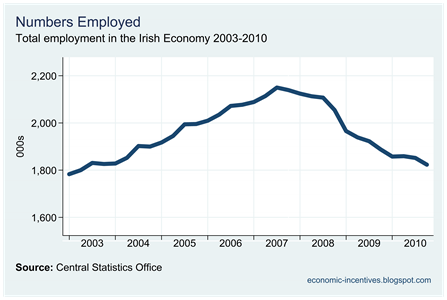
Today’s release of the Q4 2010 Quarterly National Household Survey makes for grim reading.  Here will we consider the decline in the some of the main employment measures and how much of the Celtic Tiger growth has been given up.  These are non-seasonally adjusted figures.

First here’s total employment in the economy.

Total Numbers Employed

Total employment is now back to levels last seen in the middle of 2003. Employment peaked at 2.15 million in the middle of 2007.   Since then employment has fallen by 326,600 and now stands at 1.82 million.

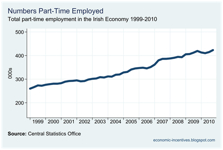
This just gives the total numbers in employment.  Another issue to consider is the type of employment.  At the start of 2007, 82.6% of those employed were in full-time employment with 17.4% employed part-time.  The figures for Q4 2010 show that percentage of those employed in full-time employment has fallen to 76.8%, with a corresponding increase in the percentage part-time employed to 23.2%.

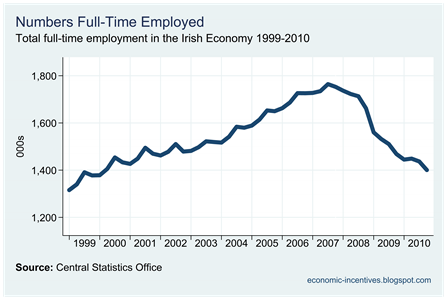
If we focus on the total numbers in full-time employment we find we have to back further than 2003.

Full Time Employed

Those in full-time employment is now back to a level not seen since 2000.  On the other hand the numbers employed part-time have never been greater as shown here.

Part Time Employed

Until 2007, the increase in the numbers part-time employed was because of an increase in female part-time employment.  Since then this has been largely unchanged and the increase in part-time employment since 2007 is because of increasing male part time employment.  Graph in here.

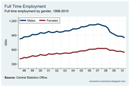
To finish we can look at the patterns in the numbers in full-time employment by gender .

Full Time Employed by Gender

It is evident that the drop in employment has been more severe among male workers.  The number of males in full-time employment was 853,000 in Q4 2010.  This is lower than it was in Q3 1998 when 868,900 males were in full-time employment.  At that time there was 71,000 unemployed males looking for full-time employment.  Now there are 199,200 seeking similar.

Male full-time employment is now back to 1998 levels.

Sunday, March 13, 2011

The changing burden of taxation

Here is a graph that shows the approximate proportion of income tax paid by each income decline (the first decile are the lowest 10% of incomes reported to the Revenue Commissioners, the second decline are the next 10% of incomes and so on).  These figures are approximate as the Revenue do not provide individual level data and they are calculated using the income ranges used in the Revenue’s Annual Statistical Reports.

Income Tax Paid by Decile

The gradual shift of the income tax burden can be seen.  Back in 1997, the top income decile paid 46.1% of the total income tax.  By 2008 this had increased to 60.1%.  The proportion of income tax paid by all other deciles has declined with the largest relative falls seen in the lowest deciles.

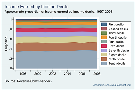
Of course, it could be that the tenth decile is paying a greater proportion of the income tax because they are earning more of the income.  Here are the approximate proportions of income earned by the same deciles.

Income Earned by Decile

The proportions show the unequal distribution of earned income but are remarkably stable.  In 2000 the top decile earned 35.7% of the gross income reported to the Revenue Commissioners.  In 2008 the proportion was 35.7% – absolutely no change.  Much the same holds for all income deciles.

Saturday, March 12, 2011

Effective Income Tax Rates

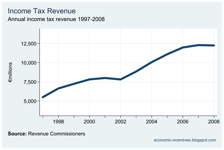
Since 1997 Income Tax Revenue rose on an almost annual basis from €5.5 billion in 1997 to €12.3 billion in 2008.

Income Tax Revenue

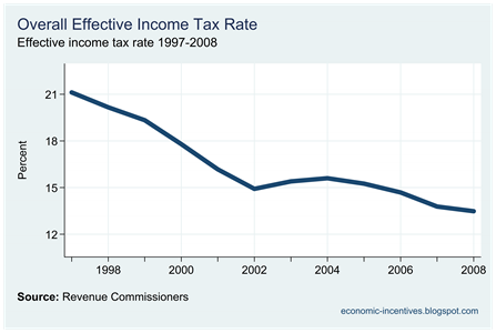
At the same time, however, the changes introduced in the intervening budgets saw the actual effective rate of income tax fall.

Overall Effective Income Tax Rate

Using data from the Revenue Commissioners Annual Statistical Report shows that the effective rate of income tax applied to total gross income fell from 21.1% in 1997 to 13.5% in 2008.  These figures are derived from Table IDS1 from the Revenue’s Income Distribution Statistics and give the actual amount of tax collected as percentage of gross income.  If the 21% was applied to the 2008 gross income, tax revenue would have been €7 billion higher.
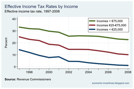
The statistics also allow us to examiner the effective rate on incomes in different ranges.  Here we will consider just three.

  • Incomes under €25,000
  • Incomes between €25,000 and €75,000
  • Incomes over €75,000

The following graph gives the average effective rate applied to all gross incomes in these ranges.  It should be noted that these are not inflation-adjusted.  An income of IR£20,000 in 1998 (roughly equivalent to €25,000) would not be the same thing as an income of €25,000 in 2008 but we can use this to give a general guide to what has happened to effective tax rates to “low”, “middle” and “high” incomes.

Selected Effective Income Tax Rates

For all categories the effective rate has fallen.  In percentage points, the biggest fall was seen in the middle category which fell by 14.9 percentage points from 25.0% to 10.1%.  The effective rate on low incomes fell by 13.1 percentage points from 14.2% to 1.1% – unless it was to turn negative it could not really have fallen by much more.  The smallest percentage point drop was seen for high incomes which fell by 10.5 percentage points from 33.2% to 22.7%.

In proportionate terms the biggest fall occurred for low incomes with the effective income tax now over 90% lower than it was in 1997.  For middle incomes the effective income tax rate is now 60% lower than it was in 1997.  The smallest proportionate fall was for high incomes where the effective rate is 32% lower than it was in 1997.

Here is the proportion of the total income tax paid by each income group.

Proportion of Income Tax Paid

This is not a true measure of the changing distribution of the income tax burden as part of the change is due to the change in incomes that has occurred since 1997.  A graph of the proportion of income earned by the three ranges used can be seen here.  A truer measure of the burden would to represent income deciles in the graph.  Maybe later.  The jump in 2001 is because this was a “short” tax year as the tax year was altered to comply with the calendar year. 
In 1997 incomes under €25,000 accounted for 44.1% of aggregate gross income and paid 29.7% of the total income tax.  By 2008, such incomes accounted for 14.6% of income and paid 1.2% of the total income tax.
Income between €25,000 and €75,000 made up 45.1% of the aggregate income and paid 53.4% of the total tax.  The proportion of incomes from this range was 48.2% in 2008 but the proportion of tax paid had fallen to 36.2%.

Earnings for the high income bracket accounted for 10.8% of total income in 1997 and they paid  16.9% of the total tax.  By 2008 these earnings accounted for 37.2% of the total but they now paid 62.6% of the tax.

Friday, March 11, 2011

Income Tax stats by group

The Revenue’s income tax distribution statistics allow us to compare across three groups – PAYE workers, self-employed workers and proprietary directors.  We have considered the first two in previous posts.  Click table to enlarge.

Income Tax Stats by Category

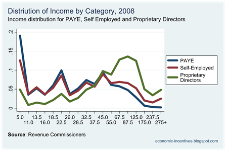
Here is the distribution of income by each category.

Income Tax by Category 2008

The distributions of PAYE and self-employed workers largely track each other, though it is noticeable that the distribution for self-employers workers has a fatter right tail (more higher earners).  The distribution of income of proprietary directors (directors of companies they own) is substantially different to the other two.  It has fewer lower earners and more higher earners.

It is important to note that the horizontal axis in these graphs is not to scale.  All points are equi-distant apart even though the absolute gaps increase.

Here are the average effective tax rates for each group.

Effective Tax Rates 2008

The rates across all three groups are progressive.  Lower paid PAYE workers have the lowest average tax rate and the rate does not rise above zero until near €20,000.  However, top earning PAYE  workers have the highest average effective tax at 34%.  It is only at income above €100,000 that the effective tax rate on proprietary directors falls below that of PAYE workers. 

The effective tax rate on the self employed is lower than PAYE workers at all income levels above €30,000.   It should be noted that these rates are calculated based on gross income rather than taxable income.

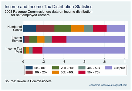
Self employed and the Income Tax

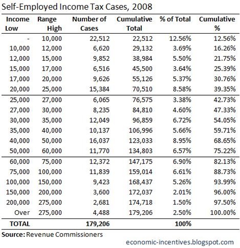
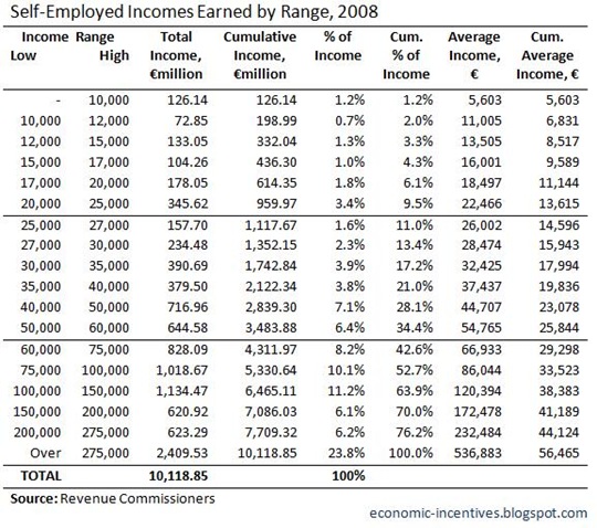
In this post we consider the Revenue’s 2008 income distribution statistics for the self- employed.  As no table is directly provided on the self-employed, the numbers used are generated as the difference between those on Table IDS2 (self-employed including proprietary directors) and Table IDS7 (proprietary directors).  We use the same format as before.

Here are the the number of self-employed tax cases in each income bracket.

SE Income Tax Cases 2008

There 49,780 of these cases filed jointly where both partners were income earners so this table covers 228,986 earners.  In the self-employed category 11.3% had incomes greater than €100,000 compared to 4.0% in the PAYE category.  The proportion in the top range is significantly higher than for the PAYE group, 2.5% versus 0.2%.

Here is the income earned in each of these income ranges.

SE Income Earned by Range 2008

This group had an income of €10.1 billion or 11.1% of the total reported.  Nearly 24% of the income earned was done by the 2.5% of cases in the top income category.  The average income earned was €56,465, though if we account for double-income joint filings, the average income per earner is just €44,190.  The median income is around €32,000.

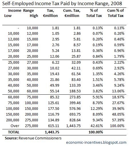
Next we turn to the tax paid across the income ranges.

SE Income Tax Paid by Income Range 2008

This group paid 11.8% of the total income tax.  Within this group 42.6% was paid by the 2.5% in the top income category.  The bottom 54% of self-employed cases, earning €35,000 or less paid 4.3% of the income tax.

Finally we’ll look at the effective tax rates and average amount of tax paid.

SE Effective Tax Rate and Average Tax Paid 2008

Again the tax rates are progressive but it is interesting to note that the effective rates for high-earning self-employed people are lower than the equivalent rates for PAYE taxpayers.  The effective rate in the top income range here is 25.5% while it is 34.1% in the PAYE group.  However, the overall effective rate among the self-employed at 14.3% is higher then the equivalent in the PAYE group 12.5%.

SE Income Tax Distribution 2008

The PAYE worker and the Income Tax

In a previous post we considered the distribution of income and income tax across all earners in the State using Table IDS1 from the Revenue Commissioner’s 2009 Statistical Report.  Here we use Table IDS6 for mainly PAYE incomes assessed under Schedule E (excluding proprietary directors on the Schedule E record) to carry out the same analysis.  In a subsequent post we will look at the self employed and proprietary directors.

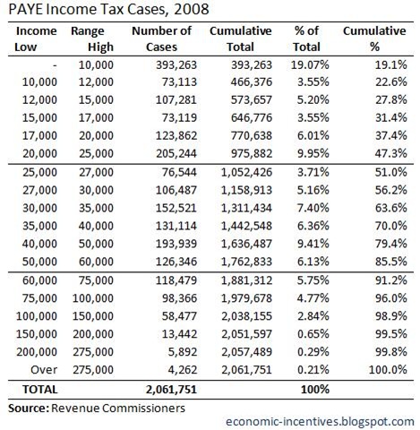
Here is the number of PAYE tax cases.

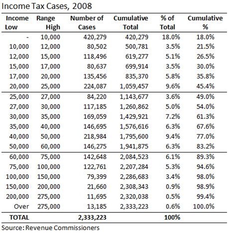
PAYE Income Tax Cases 2008

There were just over 2 million PAYE income tax returns filed with the Revenue Commissioners in 2008. There 333,538 joint returns filed were both partners earned income so this table covers about 2.4 million people.

The distribution of incomes is largely similar to those reported in the total table (which is not surprising as these earners form such a large part of the total) but it is interesting to note that the right tail in this table is relatively flatter.  In the total table 5.4% of tax cases had an income of €100,000 or above.  In the PAYE sub-sample 4.0% of workers have such incomes.  The proportion in the top income range drops from 0.6% to 0.2%.

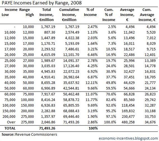
Here is the income earned in each of these income ranges.

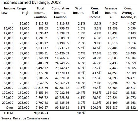
PAYE Income Earned by Range 2008

There was around €71.5 billion of PAYE income in 2008 which is 78.7% of the total income reported.  The average individual income for all PAYE tax cases filed was €34,676.  The median income is somewhere around €26,000.  The average income in the top range was €480,000, which is lower than the €560,000 seen when looking at all tax cases.  These top cases earned 2.9% of the total income here compared to 8.1% in the total cases.

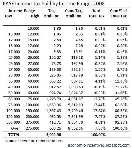
Next we turn to the tax paid across the income ranges.

PAYE Income Tax Paid by Income Range 2008

Just under €9 billion of income tax was paid on the €71.5 billion of earned income.  The 51% of cases earning less than €27,000, with 19.7% of the income, paid 2.2% of the tax.  The 4% of cases reporting incomes of more than €100,000, with 17.6% of the income, paid 37.3% of the tax.

Finally we’ll look at the effective tax rates and average amount of tax paid.

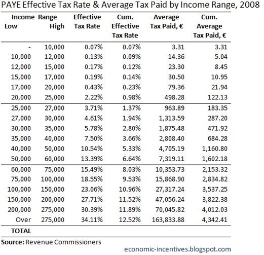
PAYE Effective Tax Rate and Average Tax Paid 2008

For PAYE earners the tax system is progressive, with the effective tax rate rising through each income range from 0.1% to 34.1%.  The effective tax rate on those in the top income range here is higher than the 28.0% seen for all cases.   The income tax burden on those earning less than €20,000 was essentially zero and was just over €100 a month for those earning €30,000. 

It would take 1,178 people in the top income range to pay the same amount of tax 1,052,426 as those earning less than €27,000 but it would take 29,341 of the top earners (if they existed) to earn the same total income as this group.

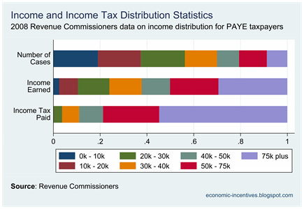
Here is a graph that helps to illustrates these points.  This gives the proportion of cases, income earned and tax paid across seven income ranges.  Watch the navy and maroon disappear in the “Income Tax Paid” bar while the lilac becomes ever more evident.

PAYE Income Tax Distribution 2008

Who pays the Income Tax?

The Revenue Commissioners have released the “Income Distribution Statistics” section of their 2009 Statistical Report.  This part of the report gives details of income and income tax payments across the income distribution.  The 2009 Report gives the figures for 2007 and 2008.  We will look at the 2008 figures here with these details taken from Table IDS1 on page 31.

First up here is the breakdown of the number of tax cases in each income bracket.

Income Tax Cases 2008

In 2008 the Revenue Commissioners handled over 2.3 million tax returns.  Of these, 432,058 were joint returns by couples with two earners, so the number of earners is actually over 2.7 million.  There were 379,541 returns from couples with one earner and 1,521,624 individual tax returns.

It is also important to note that this total included all income earners and not just those in employment.  The income range with the greatest number of cases is €0 - €10,000 which accounts for nearly one-fifth of the total number of cases.  This is may include part-time workers but also non-workers with a source of passive income (interest, dividends, rent etc), particularly retired people.  The CSO’s QNHS suggests that there was an average of 2.1 million in employment during 2008, though some people could have entered and left this total as the year progressed.

Here is the income earned in each of these income ranges.

Income Earned by Range 2008

In 2008 there was €90.8 billion of earned income declared to the Revenue Commissioners.  The pattern of the average income and cumulative average is as would be expected.  Tax cases in the “over €275,000” range make up 0.6% of the total number of cases and earn 8.1% of total income.  These cases reported an average income of over €560,000.

Next we turn to the tax paid across the income ranges.

Income Tax Paid by Income Range 2008

There was a total of €12.2 billion of income tax paid on the €90.8 billion of income earned.  The 0.6% of tax cases in the top income category, with 8.1% of the income, paid 17.5% of the total income tax.  The 54.0% of cases below €30,000, with 26.7% of the income, paid 5.0% of the total tax.

Finally we’ll look at the effective tax rates and average amount of tax paid.

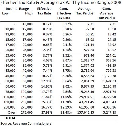
Effective Tax Rate and Average Tax Paid 2008

The Irish income tax system is progressive across all income ranges.  The highest effective tax rate of the 28.0% paid by those in the top income category.  Across all incomes the average income tax rate is 13.5%.  Again it is important to note that this is not the average tax rate on workers as all earned income is included in this total.

The very low rates of tax on incomes below €20,000 can be seen.  Incomes in the “€17,000 - €20,000” range faced an effective tax rate of 0.66% and paid an average of €121.44 in tax or €2.34 per week.  Earners in the top income range faced the 28.0% effective rate and paid an average of over €157,000 in tax – just over €3,000 per week.  There is a 30-fold difference in the average income earned in these categories and a nearly 1,300-fold difference in the amount of tax paid.

In 2008 a tax case in the “€30,000 to €35,000” faces an effective tax rate of 5.8% and paid an average of nearly €1,875 in tax for the year.  If this is a family with two children they will have collected €3,888 in Child Benefit.  The State will have given them more in income than it collected from them in income tax. 

This gap would have narrowed since 2008 with reductions in Child Benefit and changes to income tax bands and credits and the introduction of the Universal Social Charge.  It is also important to note that this analysis only includes income tax and ignore social insurance contributions (PRSI) and indirect taxes (VAT and Excise Duty).

A spreadsheet with that data used in this post is available here.

 
Unsecured Loans Proudly Powered by Blogger