Income distribution statistics garner a lot of a attention. Of the many angles given to them, one is comparisons of the incomes by decile from year to year. When the CSO first released the detailed results from the 2010 Survey on Income and Living Conditions the following chart attracted a lot of attention.
The results have since been withdrawn from the CSO and although we have some updated headline results from the 2010 SILC the revised income data by decile has not yet been released. There are many difficulties in interpreting charts like the above showing income changes by decile apart from actual data errors. One of the key difficulties is the composition of the people who make up each decile in the annual comparison.
The same people are not surveyed each year. A chart showing the annual change in income for the people in each decile over a year would be useful but that is not what the chart above shows.
We don’t have much data on the transitional dynamics through the income distribution in Ireland. Eurostat provide some insight, albeit with data that is six years old. Eurostat’s SILC database has a table on such transitions which has data for lots of countries up to 2011 but only features data for Ireland for 2007.
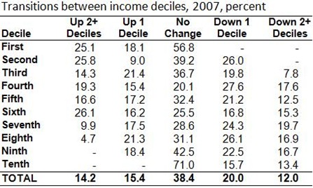
Here is a table showing the percent of people in each decile who move up, move down or remain in the same decile.
Overall, less than 40% of people are in the same decile in both years with just over 20% of people in the fourth decile in 2006 remaining there in 2007. Around 43% of those in the bottom decile had moved up, with most moving up more than one deciles.


No comments:
Post a Comment